

Ayabambi
This project centred around creating a typographical visual interpretation of an i-D article about AyaBambi, a Japanese dancing duo known for their hypnotic, erotic, and robotic style. The aim was to transform the written narrative into a dynamic and immersive design experience.
Overview


AyaBambi's distinct style of dance, often likened to otherworldly androids in motion, presented a unique challenge in translating their essence into typographic form. The dynamic energy of their performances—sharp, synchronised, and sexy—became the foundation of the design. I used exaggerated curves, jagged lines, and bold contrasts to create a visual language that echoed the duo's electrifying movements, while still conveying the warmth and personality that defines them.
The Concept


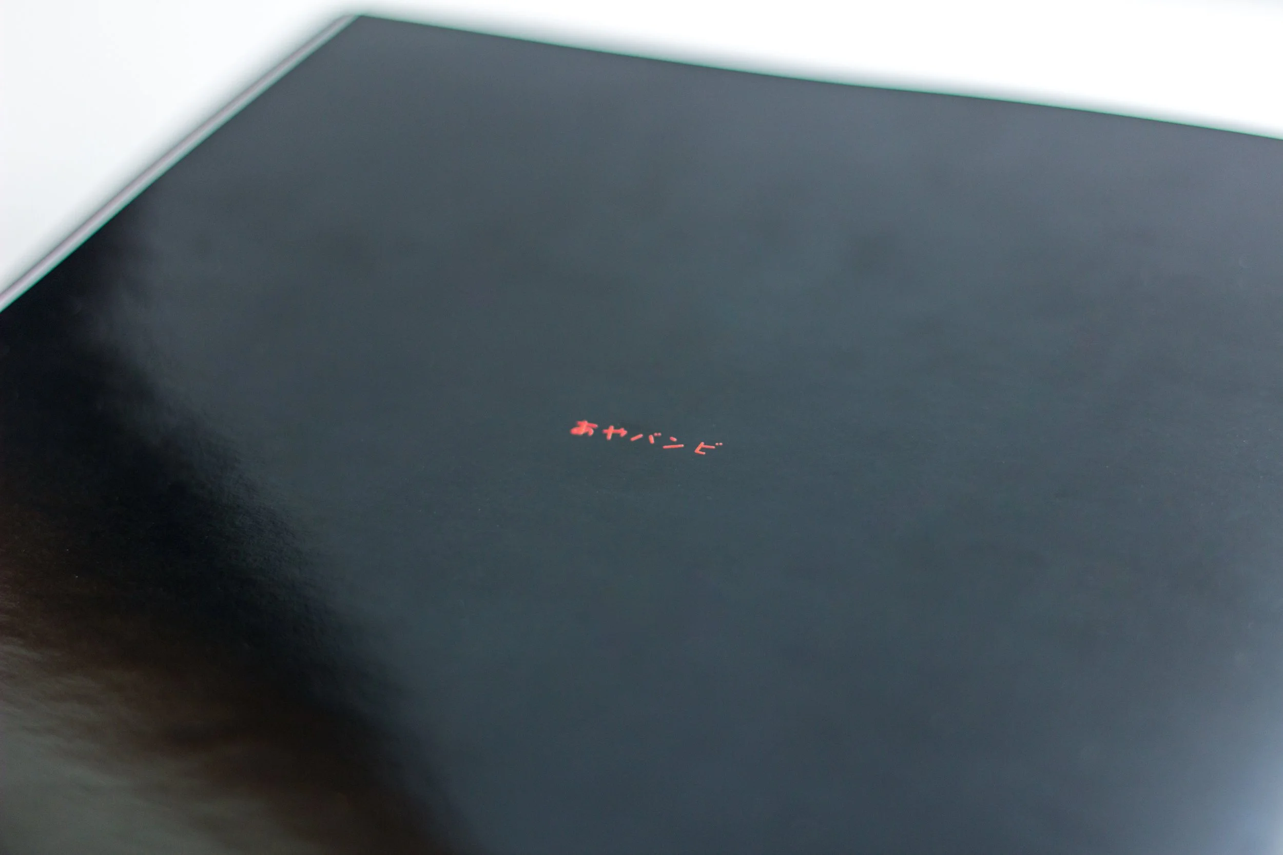
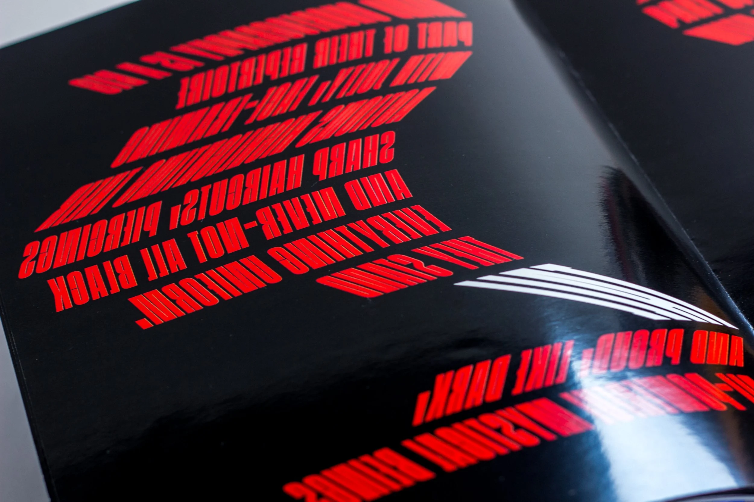
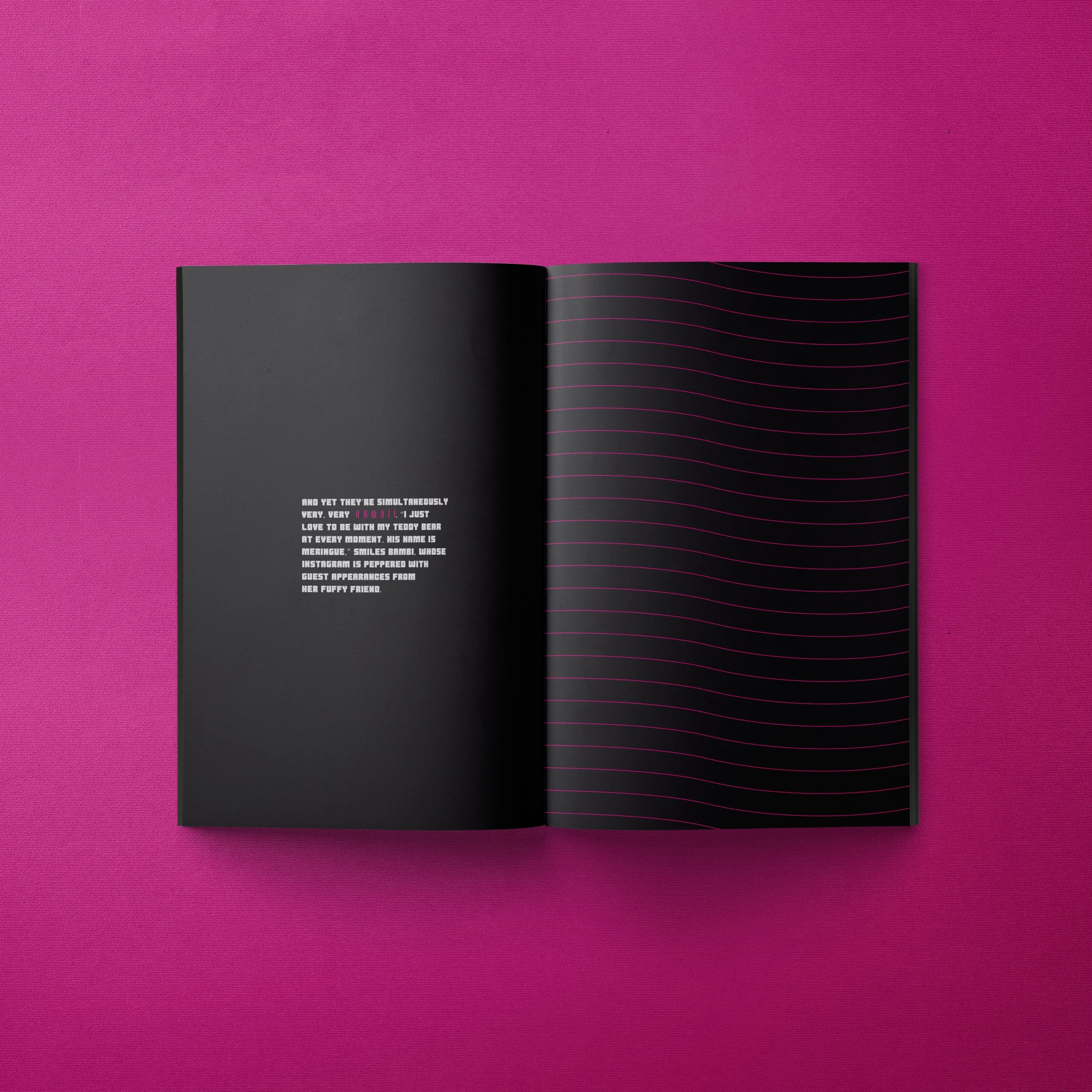
With the booklet printed on glossy paper, I used loud and dynamic black, red, and white typography that not only illustrated the story but also embodied the powerful movements of Aya and Bambi. The shapes and forms within the typography were designed to mirror the duo's fluid and fierce choreography, giving the readers a sensory experience that transcended the written word. In a direct visual representation of how Aya and Bambi perfectly mirror each other in their dance, the booklet itself mirrors text across its glossy pages. This mirrored approach emphasises the synchronicity of the duo’s movements, with each page reflecting the harmony and balance they share in their performance. The typography wasn’t just a vehicle for the text; it was an active participant in telling the story. By using a combination of bold and curvaceous fonts, I created kinetic compositions that felt as if the type was dancing off the page. Black and red were used to reflect the intensity and passion of their performance, while white was employed to create balance and give breathing room to the overall design. The typography wasn’t static; it echoed AyaBambi’s sharp movements and distinct aesthetic.
Typography & Design Execution


The booklet successfully captured the essence of AyaBambi, not just through visuals, but by immersing readers in their world. The typographic treatment gave the words movement, making the experience of reading about AyaBambi as striking as watching them perform. This project was a celebration of their artistry—transforming a written article into a multi-sensory exploration of their unique style.
Outcome