

Döppler

When Döppler, a London-based rock band inspired by Muse and Nine Inch Nails, sought a fresh logo design, they aimed for something iconic, akin to Muse's stamp-like emblem.
The challenge was crafting a logo that embodied their musical influences and hit every mark of a band's visual identity. From posters to tattoos, exuding a "frickin' cool” and “in your face" factor.


We deliberately chose not to literally depict the Doppler Effect.
This is the scientific principle from which the band takes its name, describing the frequency shift perceived as waves move relative to an observer (such as the changing pitch of a passing ambulance).
This provided context rather than directly influencing the design. The goal was to create something bold, mean-looking, self-contained, and adaptable.
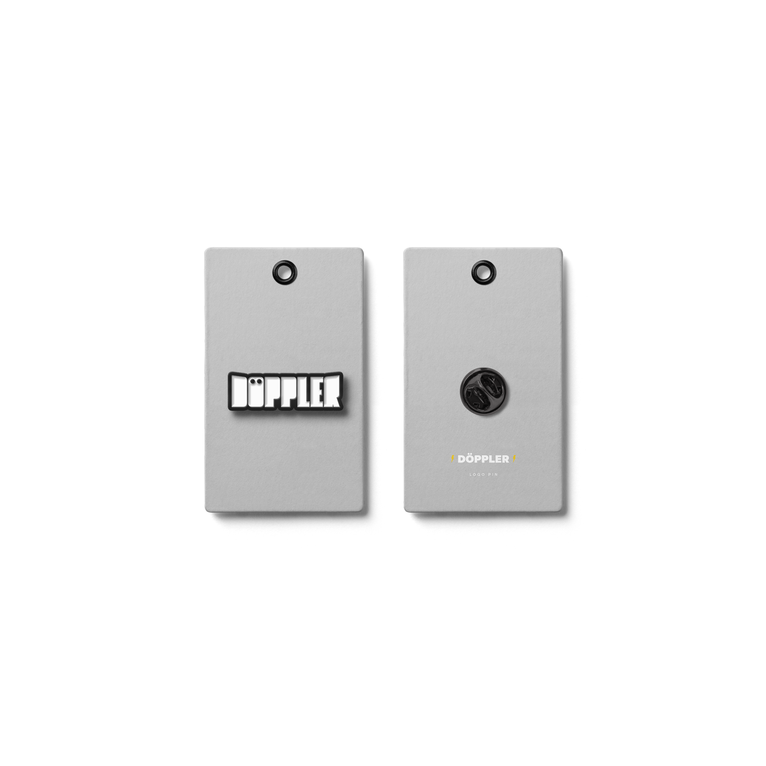
The pivotal creative decision came in filling in the counters within the letterforms, which made the logo easier to stencil. This subtle but significant modification unified the wordmark, making it balanced, robust and easily reproducible across various media, perfectly suited for stencils, flight cases, stickers, and even tattoos.
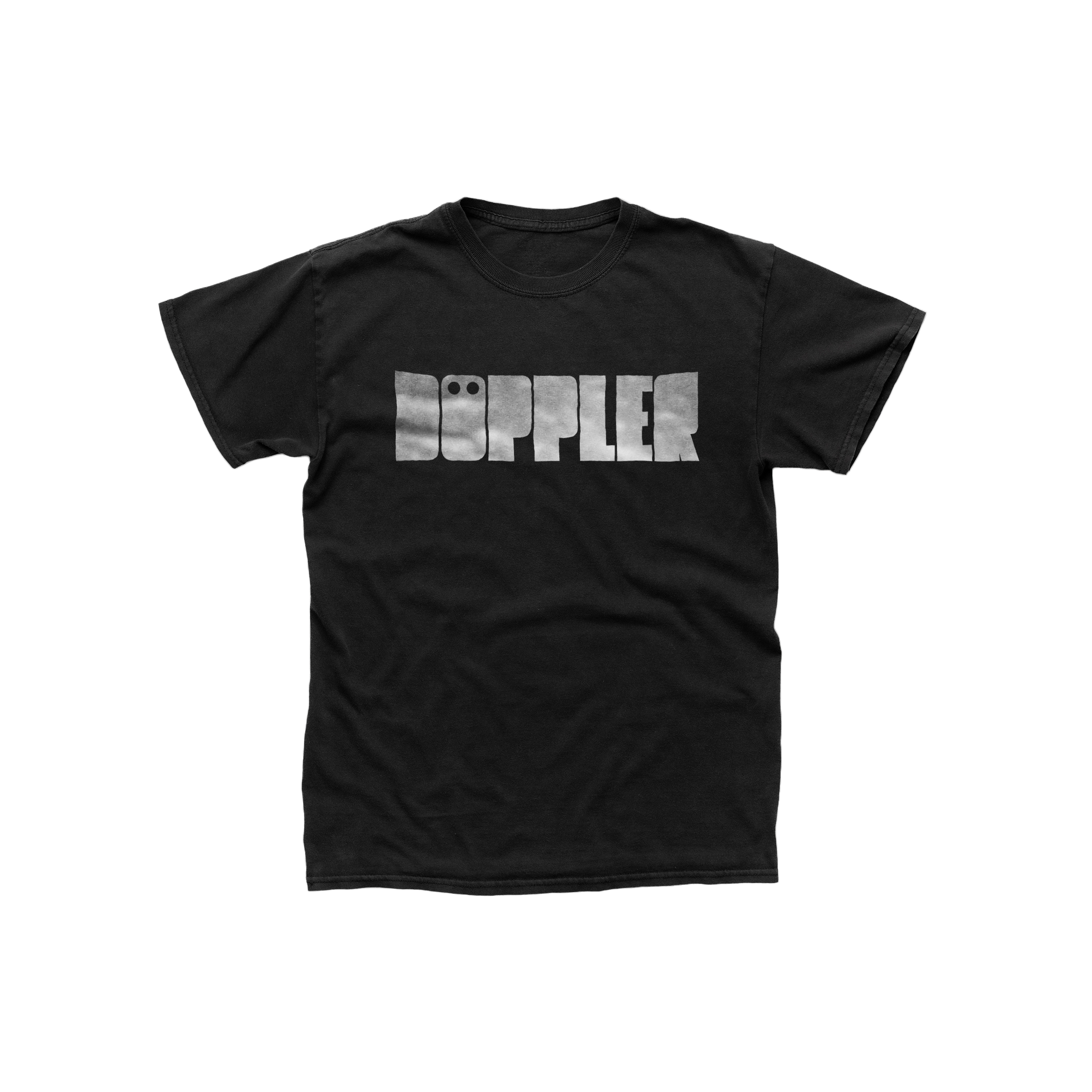
The band was instantly thrilled with the new logo, enthusiastically describing the design as "vampire-like," capturing their bold and somewhat edgy persona.
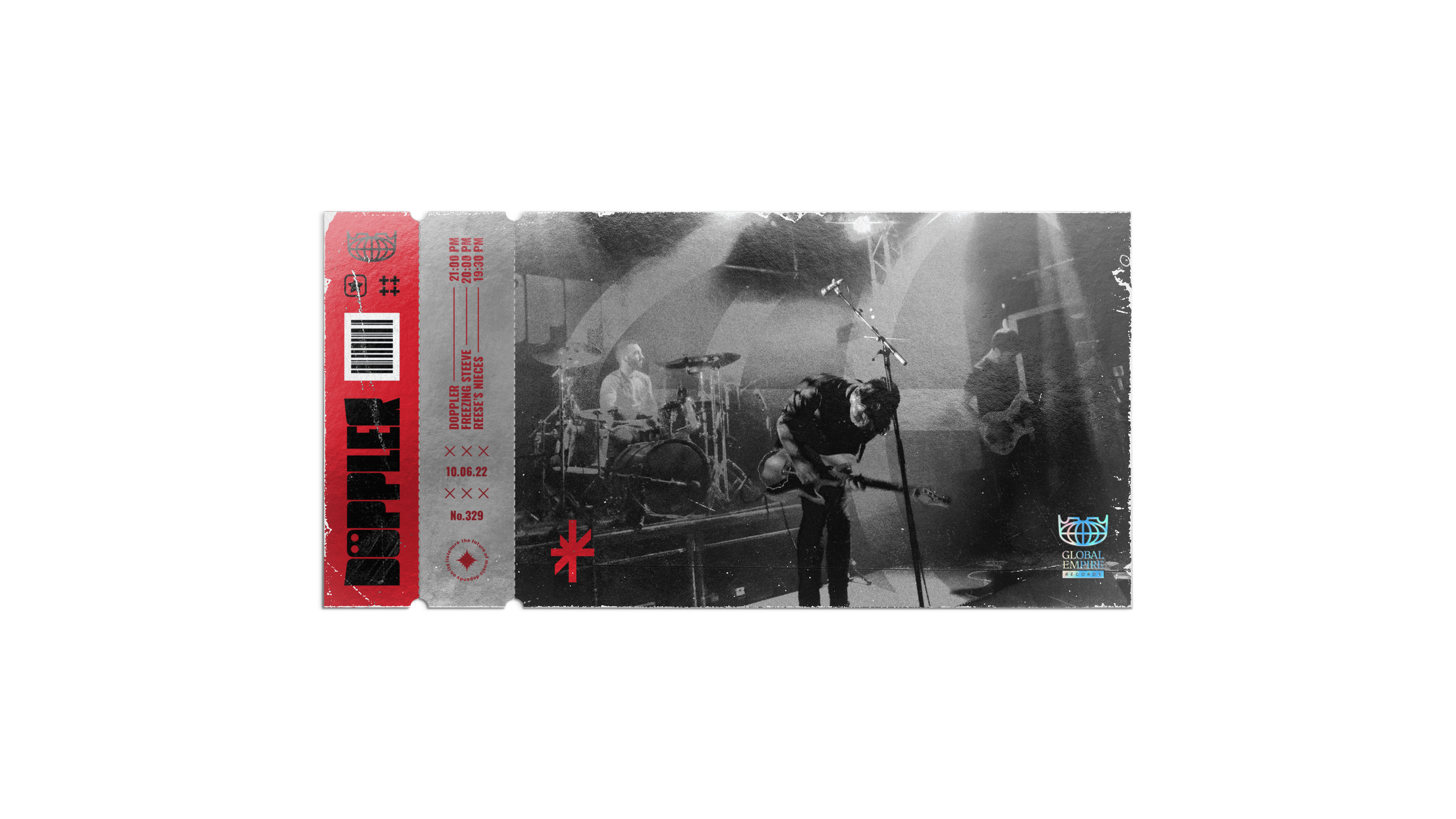
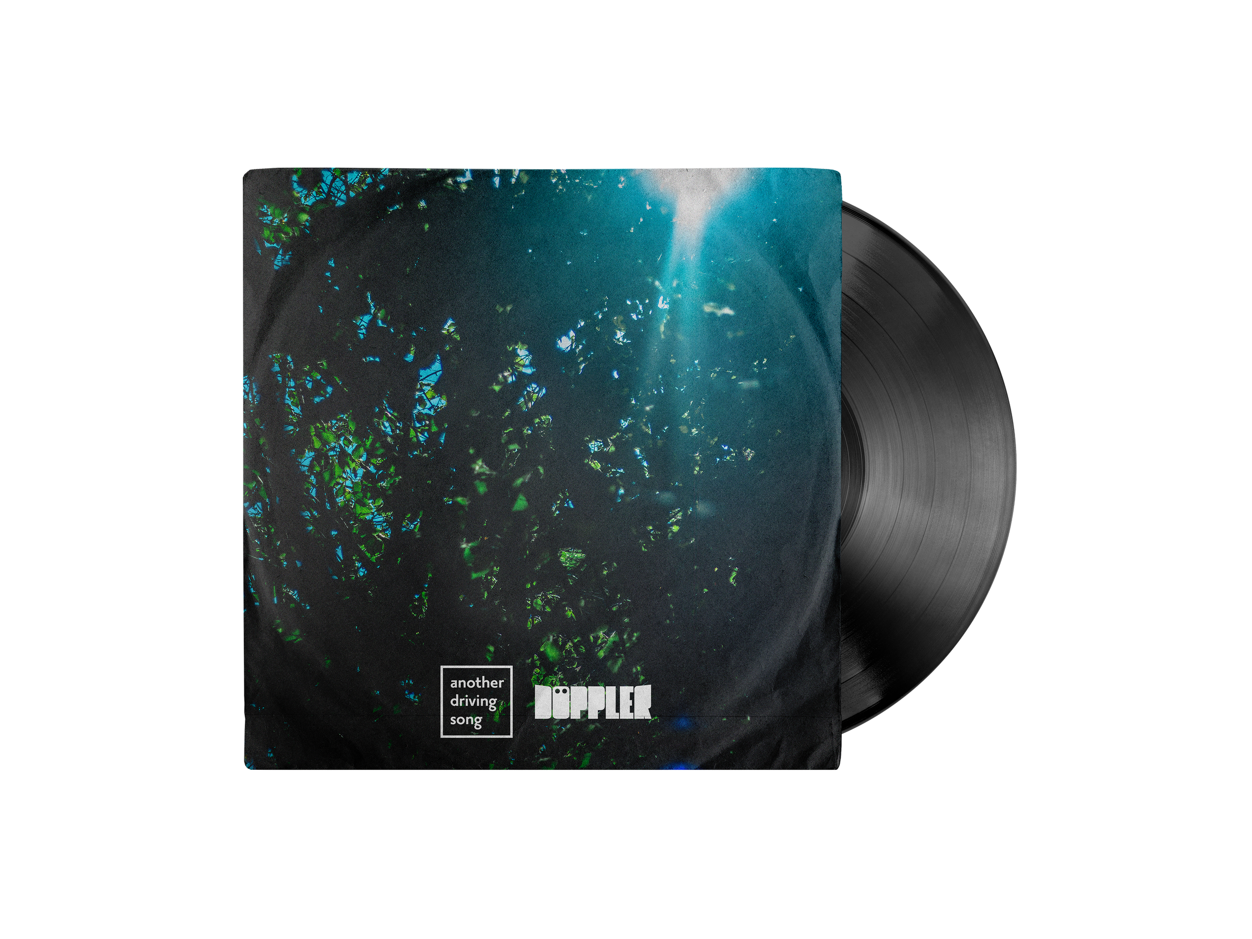
Inspired by Muse's iconic stamp-like aesthetic, the resulting visual identity quickly became an essential anchor for Döppler, prominently featured on album covers, merchandise, and stage backdrops. The logo's striking presence marks a new chapter in the band's visual identity, reinforcing their brand across multiple touchpoints.


