

Founders Faction


Founders Faction is a brand identity shaped by the belief that clarity, purpose and legacy matter more than relentless hustle.
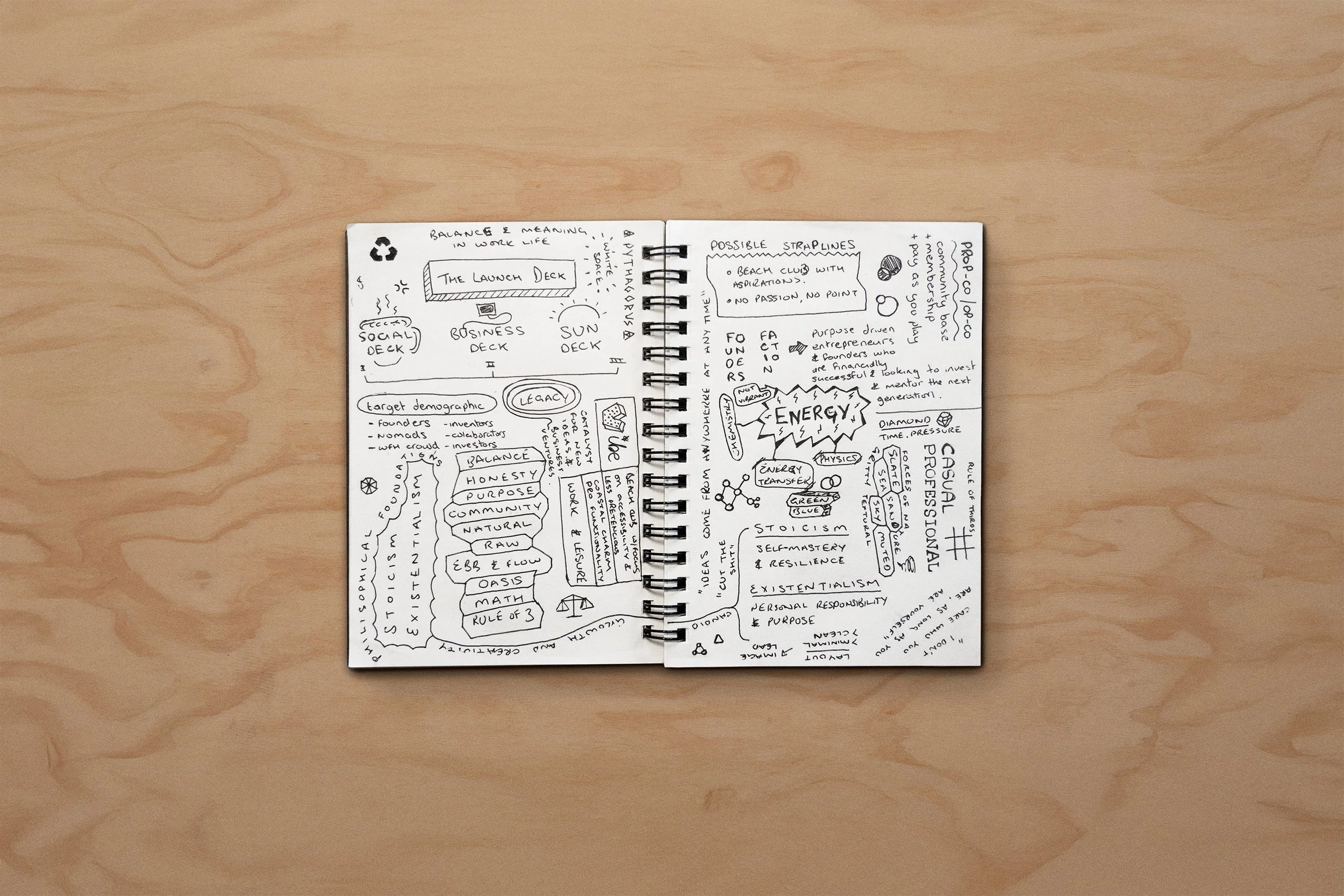
Originally imagined as a coastal co-working space for city professionals needing a bit of headspace, the idea quickly evolved. What started as a place became a philosophy. A values-led collective grounded in Stoic and Existential thinking.
It’s a brand for founders building intentionally, growing with purpose and creating something that outlasts them.
I’m proud to say that it won Gold at the London Design Awards 2025 in the category of Company Branding


This wasn’t just about workspace. It was about mindset.
Founders Faction sits somewhere between boutique retreat and business incubator. A space for deep thinking, meaningful conversations and collective momentum.
The identity had to feel grounded, human and lived-in. Less polished startup, more rugged clubhouse for people doing the work.
The identity takes cues from life by the sea. Surfboards, salt spray, sun-faded wood and sandy floors. Over time, it’s set to evolve inland, towards alpine environments. Think cabins, snowboards, slow mornings and mountain town energy.
This isn't about surface aesthetics. Everything in the brand connects back to environment, rhythm and values.
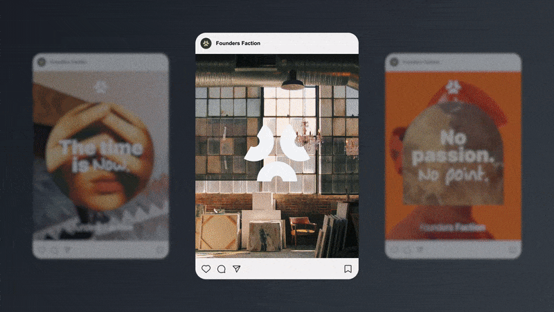
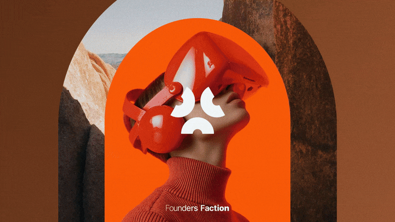
At the centre of the brand is a logo made up of three forms.
Each of the three shapes abstractly represents a person, back to back with open arms, ready to share knowledge. Together, they form a triangle, a shape often linked to stability and strength.
It’s not about everyone thinking the same way. It’s about shared intent and the strength that comes from working together.
The three shapes used in the logo form the basis of the brand system. They stand for the core values:
Purposeful Growth
Enduring Legacy
Collective Energy
They appear across layouts to guide structure and hold meaning, never just for decoration. We also added loose hand-drawn doodles (arrows, underlines, bursts) to echo the messy beginnings of big ideas.
Together, the system feels layered and intentional, with just enough room for play.


The primary typeface is Inter, used for its clarity and quiet confidence.
The wordmark is set in a variable cut of Inter, where small shifts in weight and proportion reflect the ebb and flow of collaboration.
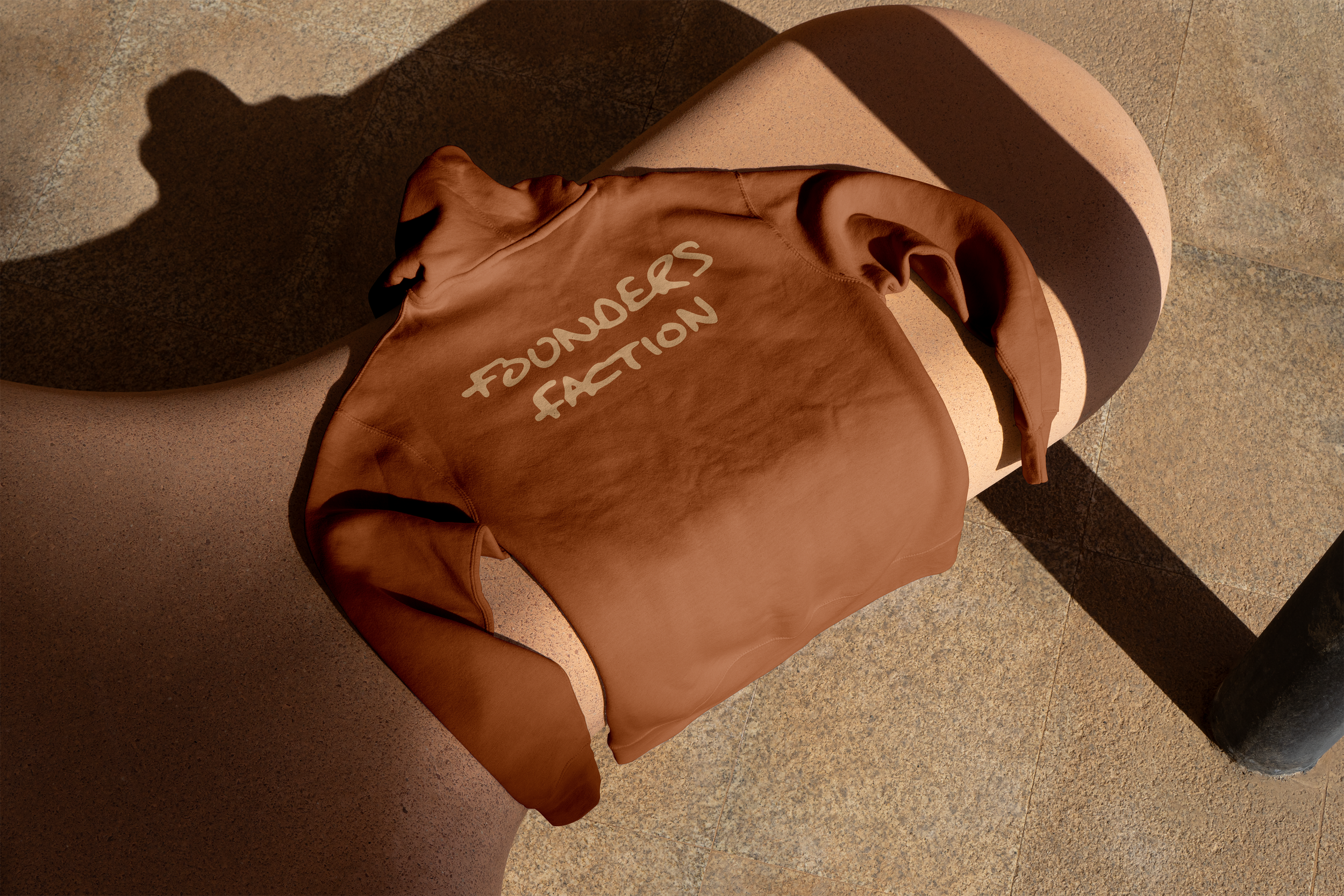
We also created a custom display typeface called Founders Hand. It’s used sparingly, adding notes of personality, spontaneity and human touch.
The colour palette is built with inspiration from natural materials and coastal surroundings. A sun-faded navy sits at the centre, supported by off-white, sandstone and soft greys inspired by driftwood and dry grasses.
Accent colours include warm terracottas, soft sky blues and gentle olive greens. The palette is designed to evolve as the brand expands into new terrains, from beach to mountain.
Everything feels grounded, understated and real.

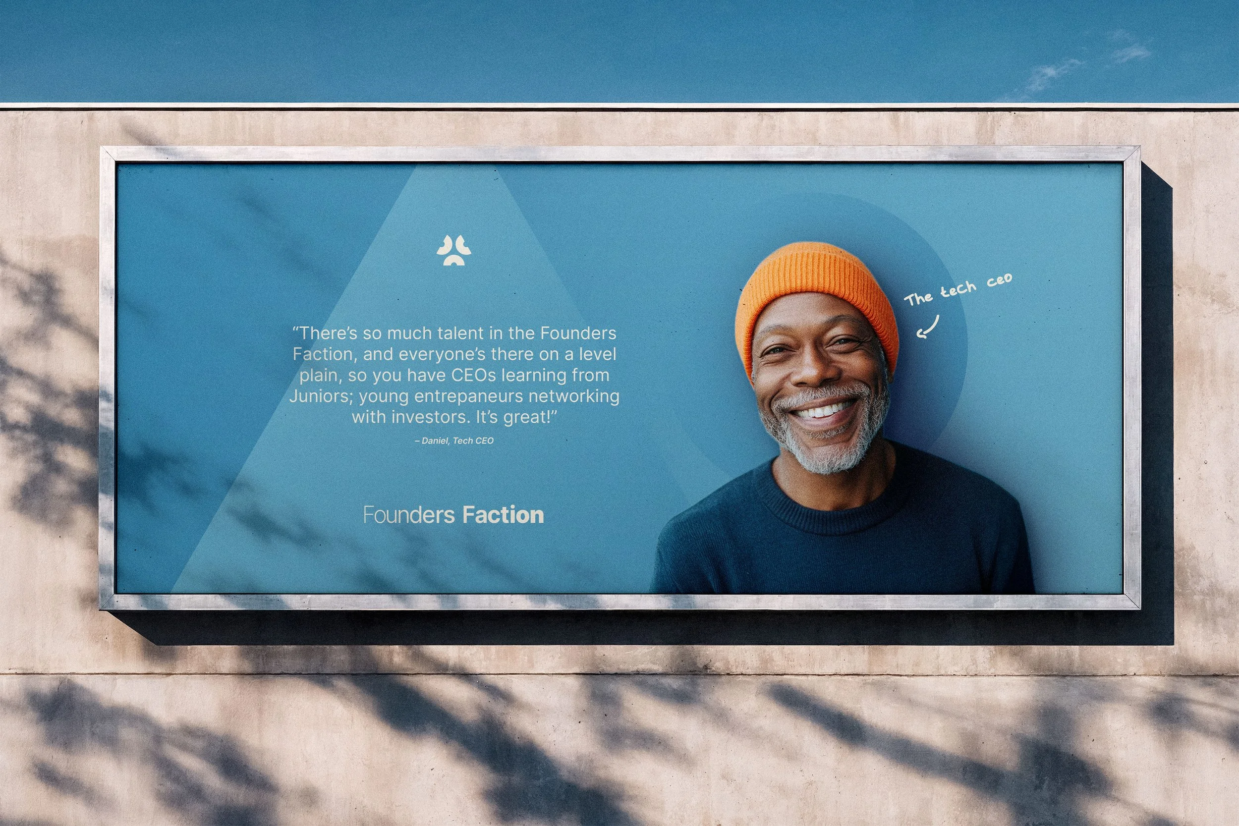
Photography focuses on people doing what they love.
Visuals are layered, warm and textured, with a strong sense of place and purpose.
We avoided anything too polished or posed. This is about capturing individuality, expertise and momentum in an honest, human way.


"The decision to use Alex was simple.
We are old colleagues, and after a chat about the project, it was a natural fit to start the process. What I didn't realise was how much he had evolved since we’d last worked together. I have huge ideas, and it takes people with a firm strategic mindset and creative specialism to harness them.
Alex's discovery process, patience, creativity, and ability to challenge me led to an award-winning brand identity before launch. He’s enabled me to unshackle my ideas and shape them into a go-to-market proposition I’m building a ten-year plan around. A great professional, an even better human being.
Alex is my go-to. It couldn’t be anyone else."
– Dan Carey, Founder