


When your relative vaguely knows what it is that
you do and asks for a visual identity for
her little business, you don’t say no.

She’s always been a DIY behemoth, and now she helps her neighbouring community in Devon with small DIY and home improvement projects that they’ve either been putting off for years, lack the knowhow or that a builder would say is too small to bother with.
Step one was giving it a name! We went though several options but Got This Liz sounded punchy, catchy and understandable.

“Learn the rules like a pro, so you can break them like an artist.”
– Picasso


Yep, this project broke a couple of rules.
The first, and sorry to give you another quote, but:
“A logo’s job is to identify, not explain“ – Ben Burns
It’s a rule that I stick to 98.3% of the time; but on this occasion we knew two things:
She and her audience aren’t the best when it comes to tech and social media.
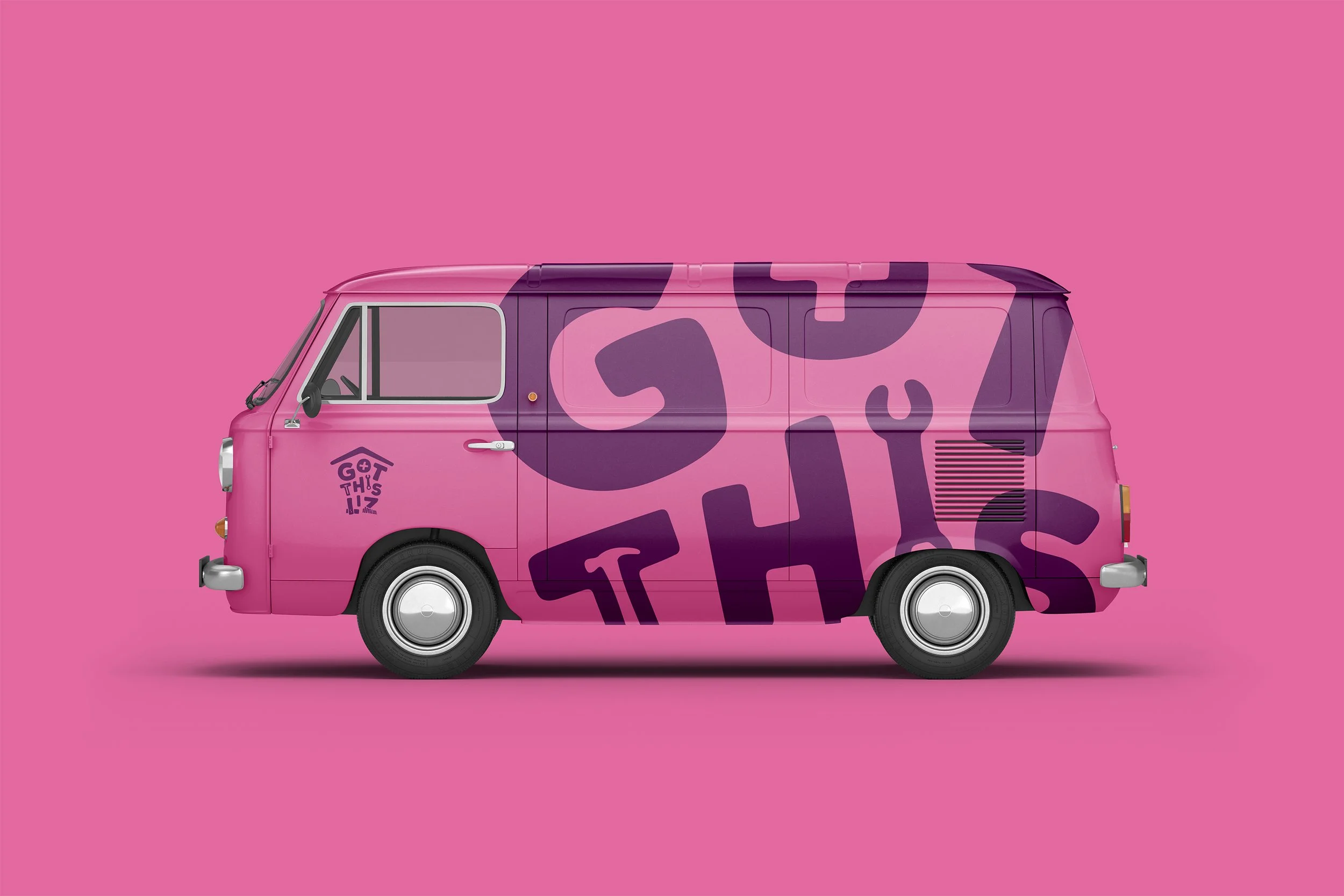
She drives around in a brightly coloured van that people recognise and talk about.
With the van being her main method of advertising, we needed a logo that said a few things so that in those 3 seconds she drives past, or when someone sees it parked up somewhere, they know instantly what she does.
The main point here is that it’s appropriate, which is a vital rule to stick with.
The second; an extensive colour palette.
My mum is a colourful, spiritual and bubbly person so it only made sense to have lots of colour. She wanted to have all of them in the logo but after demonstrating the pain points of doing that, we arrived at a compromise of having all the colours, but as monochromatic sets.

The type choices came from a want to show confidence, strength and experience, but also to have a bespoke problem solving and handmade feeling.
She also expressed that gets a little bit of stigma from the older male generation – a woman? With tools?! 🙄 – so we decided to go with an inclusive language to combat that, “Handy person”.
Now, when a woman rocks up to their door with a heavy duty circular disc saw flung over her shoulder, they get a bit of a shock, but they get over it.
