Ground

Ground is a workplace brand built on dual meaning. In a professional sense, it reflects workplace language such as “let’s touch ground”
In a more human sense, it is tied to nature, roots, and growth, and the idea of taking time away from the screen.
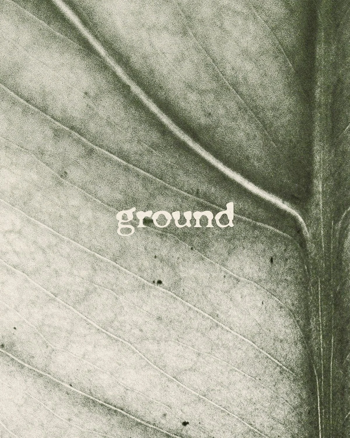
Located in Camden, the building features a rare landscaped garden with a mature apple tree. Rather than take the obvious route of using an apple or tree, the identity focused on the architecture of plants at a closer level, such as leaves and roots, and paired this with the architectural character of the building itself. The result is a brand that celebrates the harmony between nature and structure.

The client initially approached the project with a typical address-led name. While functional, it lacked character and would not stand out in the creative and technology markets they were hoping to attract.
The challenge was not only to create a brand identity but also to rename the building in a way that felt more memorable, more meaningful, and more appealing to forward-thinking businesses.


Renaming the property to Ground set the foundation for the entire identity. It is short, memorable, and layered with meaning.
It speaks to both professional language and to the natural qualities of the building.
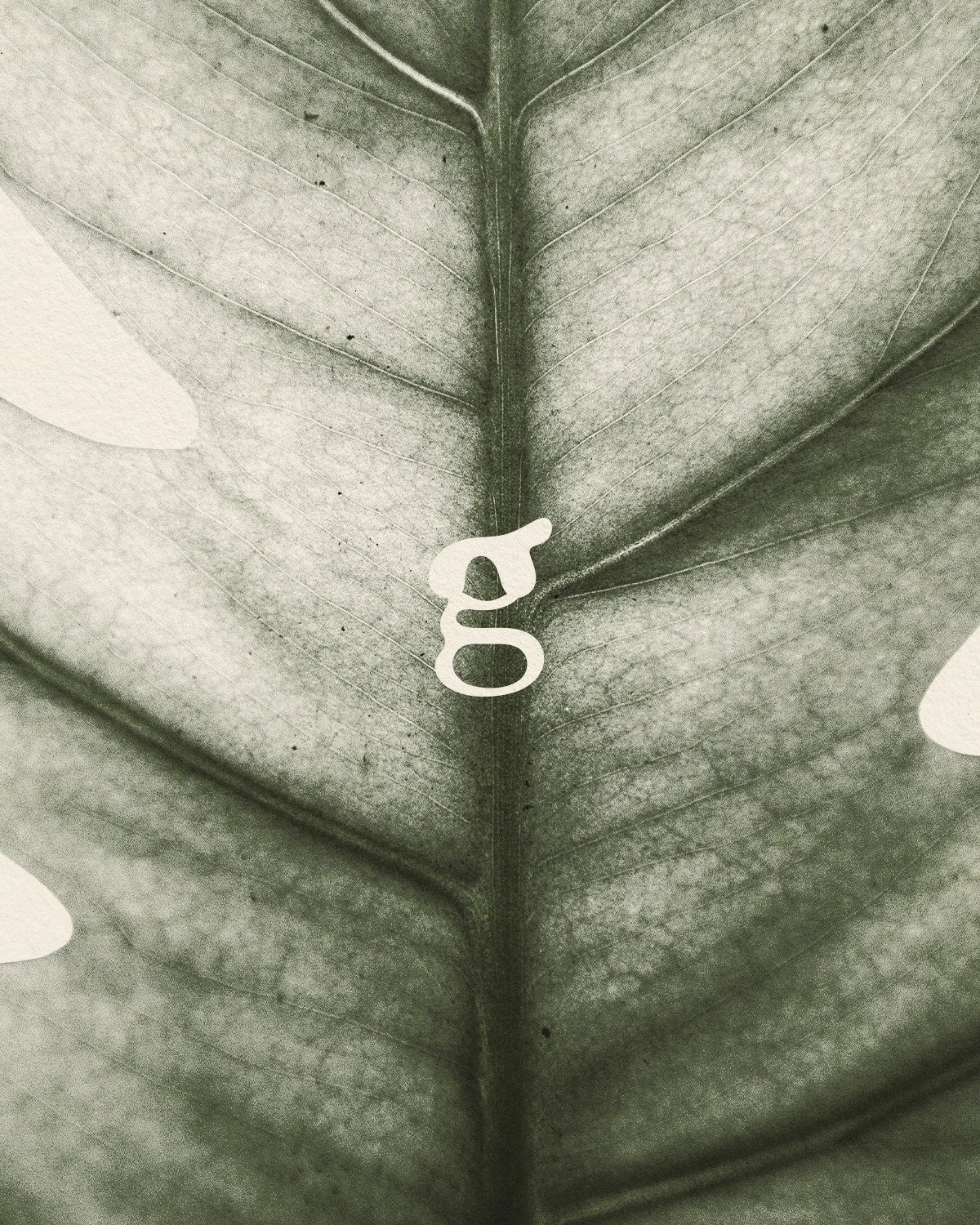
The concept took inspiration from the roots of the apple tree in the garden rather than the tree itself. Roots symbolise the starting point of ideas, campaigns, and businesses, with the potential to grow into something larger. This metaphor became the backbone of the design.
The logo is typographically led, crafted with references to both the roots of plants and the structure of the building. It reflects the duality of organic growth and architectural precision, providing a system that feels professional yet warm, structured yet human.

Ground stands apart from the typical address-led office developments in London.
It is a brand that feels rooted in its environment, professional in its tone, and appealing to the creative and tech businesses it seeks to attract.
The identity highlights the building’s rare garden and unique sense of calm while avoiding predictable visual tropes. By focusing on roots and architectural detail, the brand presents Ground as a place where ideas take shape, grow, and thrive.