

Int. Polo Academy

International Polo Academy has evolved from a global polo data leader into a cutting-edge online educational platform.
This project refreshed the brand’s visual identity by developing a new logo, typography and colour palette that capture a tech-savvy, innovative spirit while retaining its deep-rooted polo heritage. The new identity blends fun, accessibility and a hint of geekiness, paving the way for a successful transition from a B2B focus to a dynamic B2C educational service.


The primary goal was to create a visual identity that reflected the academy’s new direction as a subscription-based educational service for polo players.
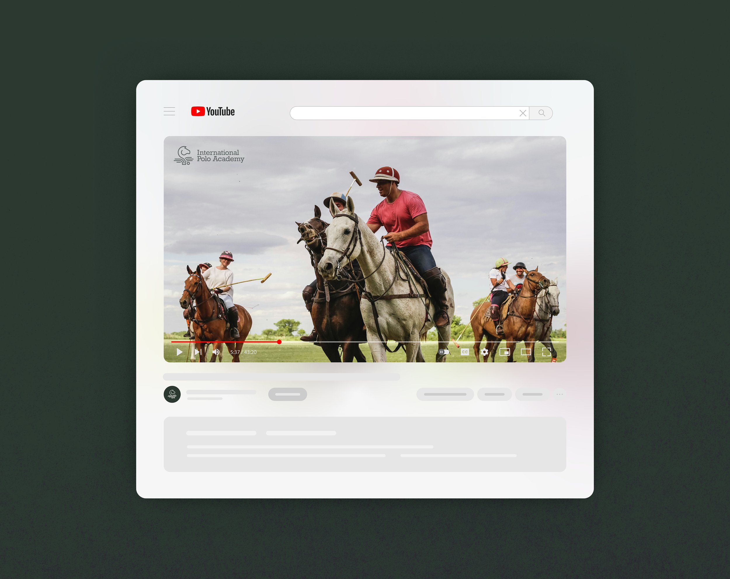
The refreshed identity needed to appeal to a younger, tech-savvy audience while remaining versatile enough for both digital and physical media applications such as embroidered merchandise and sponsorship materials. The challenge lay in balancing professionalism with an accessible, playful edge so that the identity resonated with both traditional polo enthusiasts and modern digital learners.
The design concept for the International Polo Academy identity was based on merging traditional elements with a modern twist. The approach was to move away from clichéd polo symbols while still honouring the sport’s heritage.
Initial Concepts
Although I reassured the client that traditional symbols could still be used in a fresh and distinctive way, avoiding cliché while maintaining authenticity, the client initially wanted to avoid things like mallets, horses and shields, so for early concepts, I focused on statistics and formation, drawing inspiration from the dimensions of a polo field, the tools used, and player positioning.
While these abstract ideas were very well received, there were concerns that they felt too abstract and detached from the sport itself.
To challenge expectations, I introduced a wild card concept I jokingly called "Forbidden Fruit," which re-imagined typical polo club symbols in a more modern and unexpected way. This approach demonstrated that familiar elements could be used creatively without feeling overused, allowing the brand to stay rooted in polo while standing apart from traditional clubs.
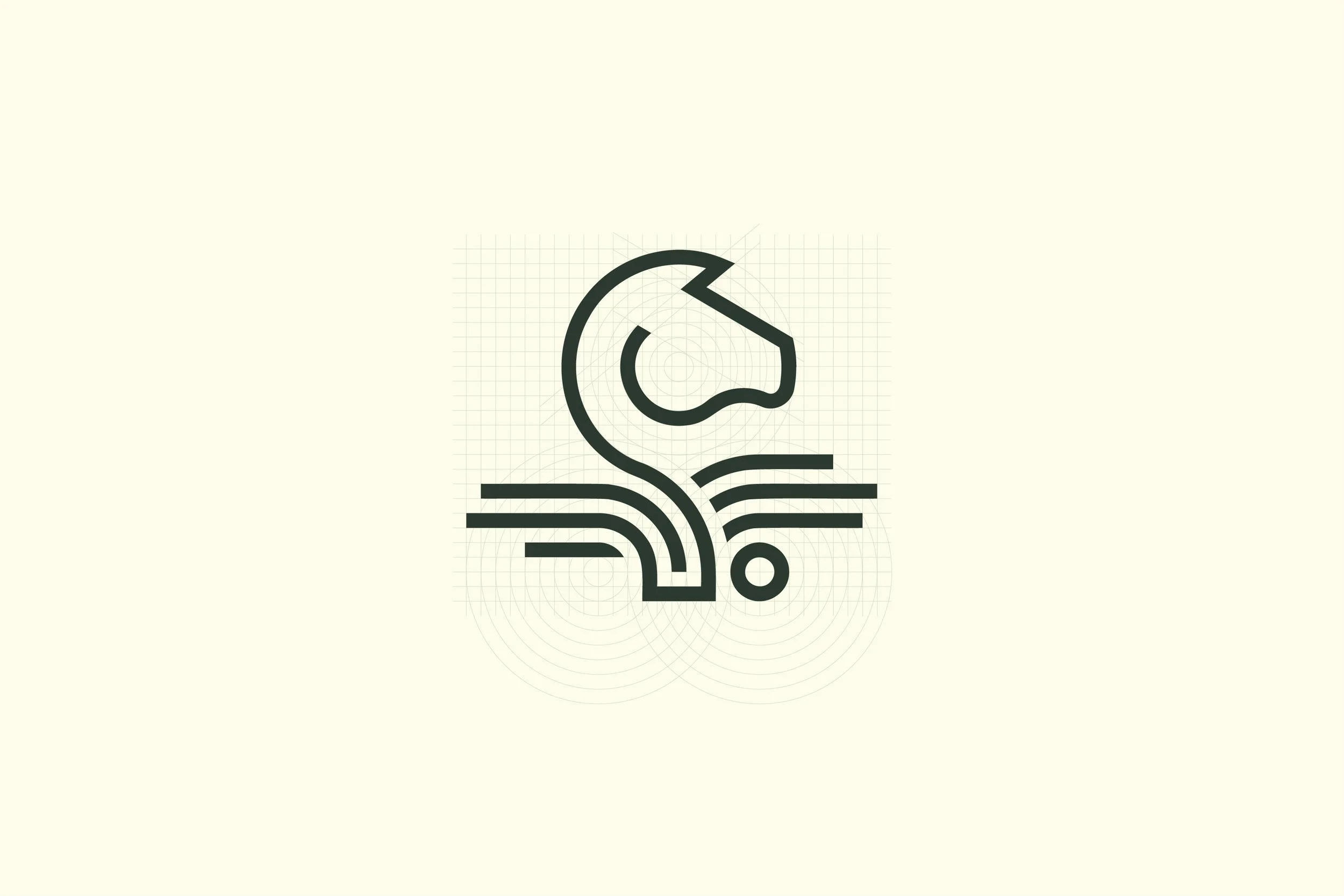
Ultimately, the final logo struck a balance between recognition and originality. A horses head and ball maintained a connection to polo’s heritage, while an emblematic book reinforced the academy’s educational focus. By simplifying shapes and reducing detail, the design remained adaptable and effective across all applications, from digital use to embroidered merchandise and sponsorship materials.


A key part of the refresh was the careful selection of typography and colour.
Multiple typographic options were explored, with the client ultimately choosing a slab serif font that strikes a balance between academic credibility and a modern, digital edge. The colour palette retains the prestigious gold and royal blue which speak to the sport’s rich tradition. Secondary lighter hues and complementary greens, inspired by the polo field, add freshness and vibrancy. This combination reinforces the brand’s dual focus on tradition and innovation, ensuring a cohesive and versatile identity.


The brand identity exploration successfully provided the client with a range of unique and considered directions, all of which were well received.
The project reinforced the importance of balancing tradition with modernity and demonstrated how polo’s heritage could be re-imagined in a fresh, digital-first way. The work serves as a strong foundation for any future development of the brand, offering a versatile and distinctive identity that can be implemented when the time is right.


What the client said.
"Alex was fantastic to work with. Friendly, flexible and a great communicator. He really took the time to chat to us about the brand and immerse himself in our project to help understand and familiarise himself with a sport he was not previously involved in. This gave him some great insight into our goals and what we were looking to achieve with the branding project and the result was a complete branding package that ticked all the boxes and gave us a great start to support our relaunch.
His delivery was punctual and well executed and he handled multiple stakeholders very well (and patiently), providing a professionally put together, beautiful finished product with plenty of options for us to choose from and explore. The discovery and exploration sessions were seamless and you could see that he had taken on board all the different aspects and nuances of the sport that we had discussed and incorporated them in subtle ways into his designs. We were very pleased with the outcome.”