

Release Assist

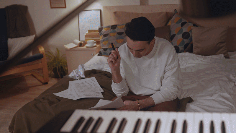
Release Assist is an AI driven music release forecast and strategy builder, helping artists understand their data, set clear goals and make smarter decisions around their releases.
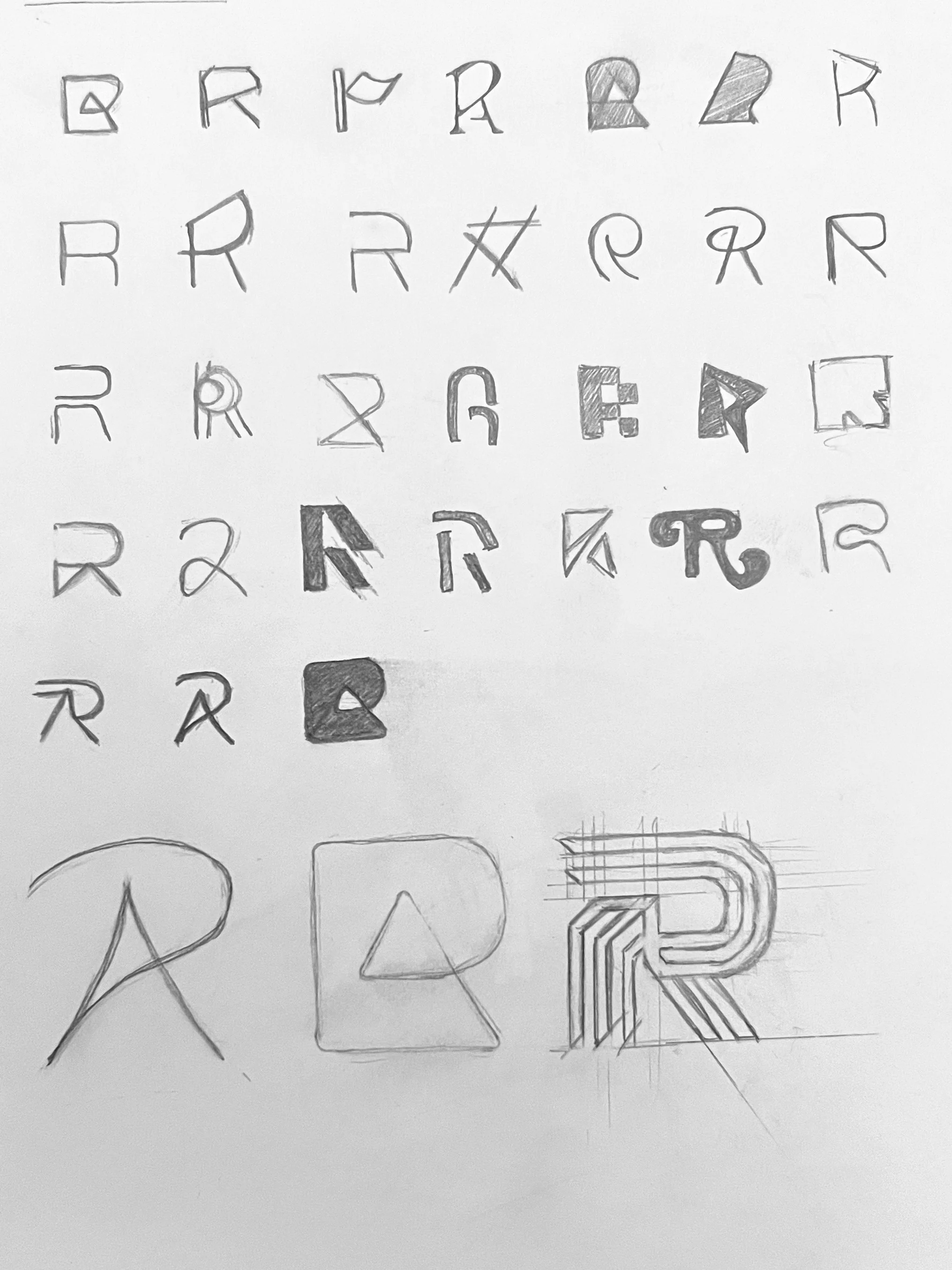
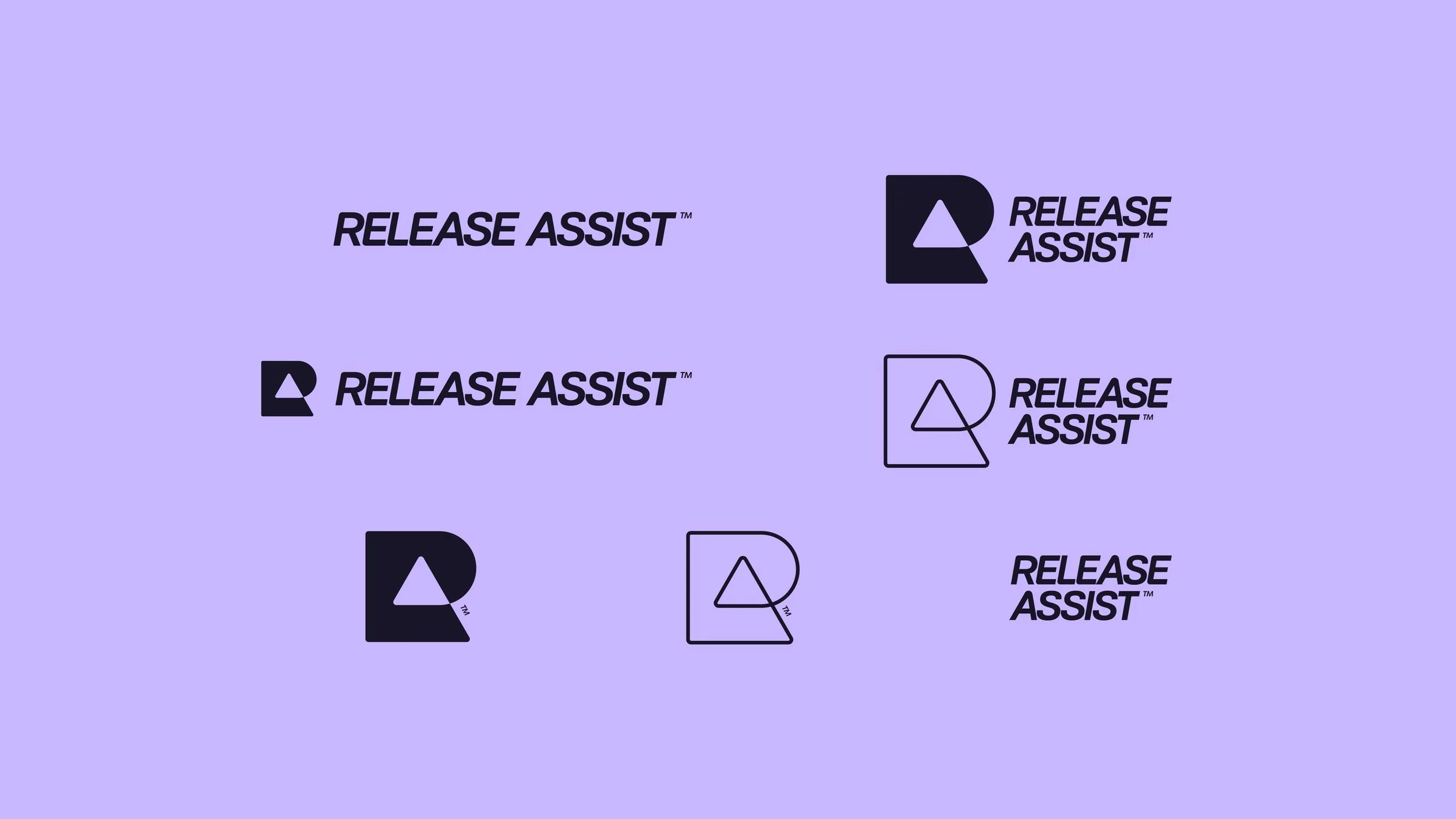
The logo is an evolution of the original idea sketched by one of the founders. The intention was there from the start, but we saw an opportunity to elevate it with deeper conceptual meaning and a more refined execution.

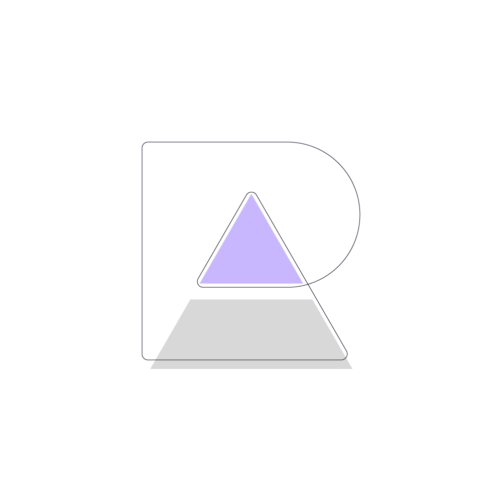
Beyond the monogram style featuring the R and A, the form is built from a continuous line.
This represents the feedback loop at the core of the product, where the output of a system is fed back in as input, allowing artists to adapt, refine and improve with every release.
The triangle or pyramid within the mark symbolises the top percentage of artists. It reflects those who understand their data and take the right actions to move into that upper tier of engaged performers. It also subtly resolves into an A, reinforcing both the brand name and the ambition behind it.
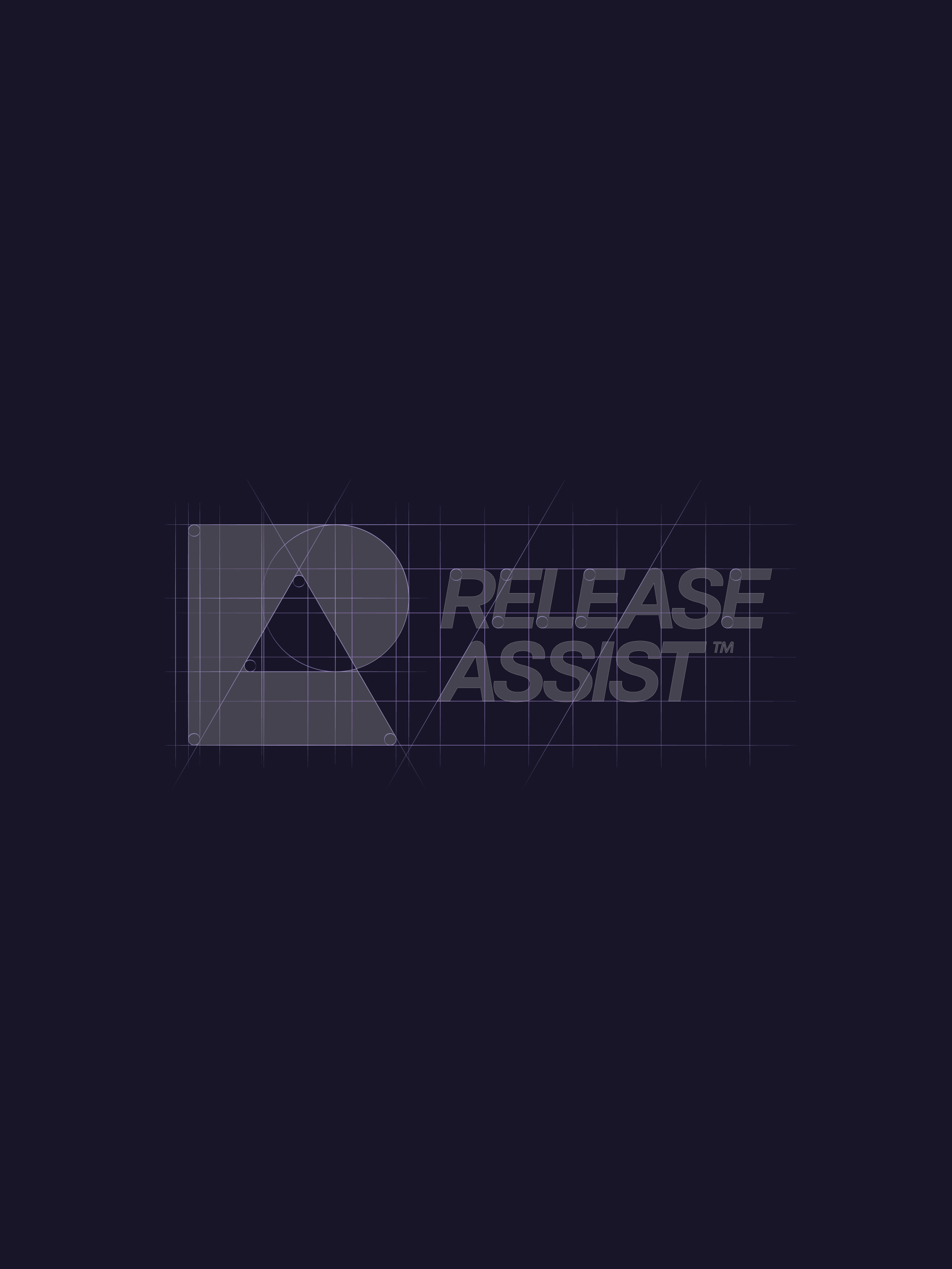
The wordmark leans forward to emphasise progression and forward thinking. It has been customised to mirror the logomark visually, with curved corners and carefully matched angles, creating a cohesive and dynamic identity.
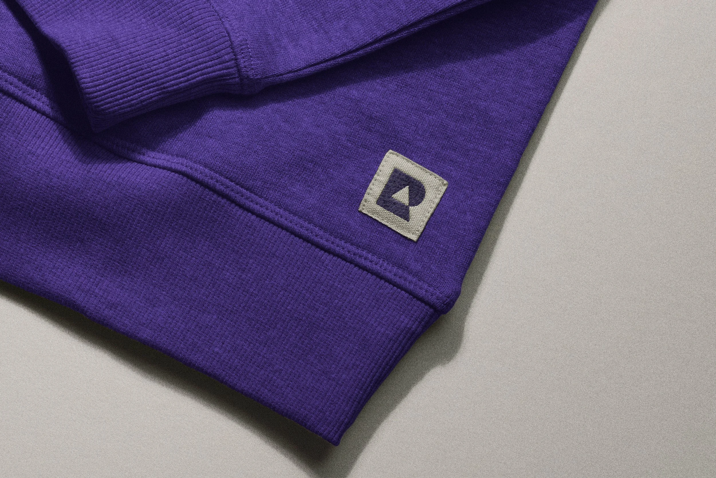
Lilac and deep purple were chosen intentionally for their association with creativity, intuition and imagination. These qualities sit at the intersection of artistry and data driven decision making, grounding the brand in both logic and creative ambition.

Feedback Loop
A continuous line that represents how insight becomes action, and action feeds the next iteration, enabling constant learning and growth.
Top Percentage
A subtle pyramid form that symbolises the artists who understand their data and take the right steps to rise above the noise.


“Alex's work was super efficient in that he knew the questions to ask in order to extract the meaning and the true value in our brand for us to go away and immediately put that brand into action.
Alex's knowledge spans so broadly, not just in brand designing, but you can tell that his creative spirit is guiding every single decision he makes and that rare level of knowledge makes him a great designer and creative!”
– Adriano Desire, Founder