
Signalworks
Signalworks is a strategic marketing and growth agency built around one core principle, prioritising signal over static.
The brand exists to help businesses cut through noise, communicate with clarity, and ensure the right message lands with impact.
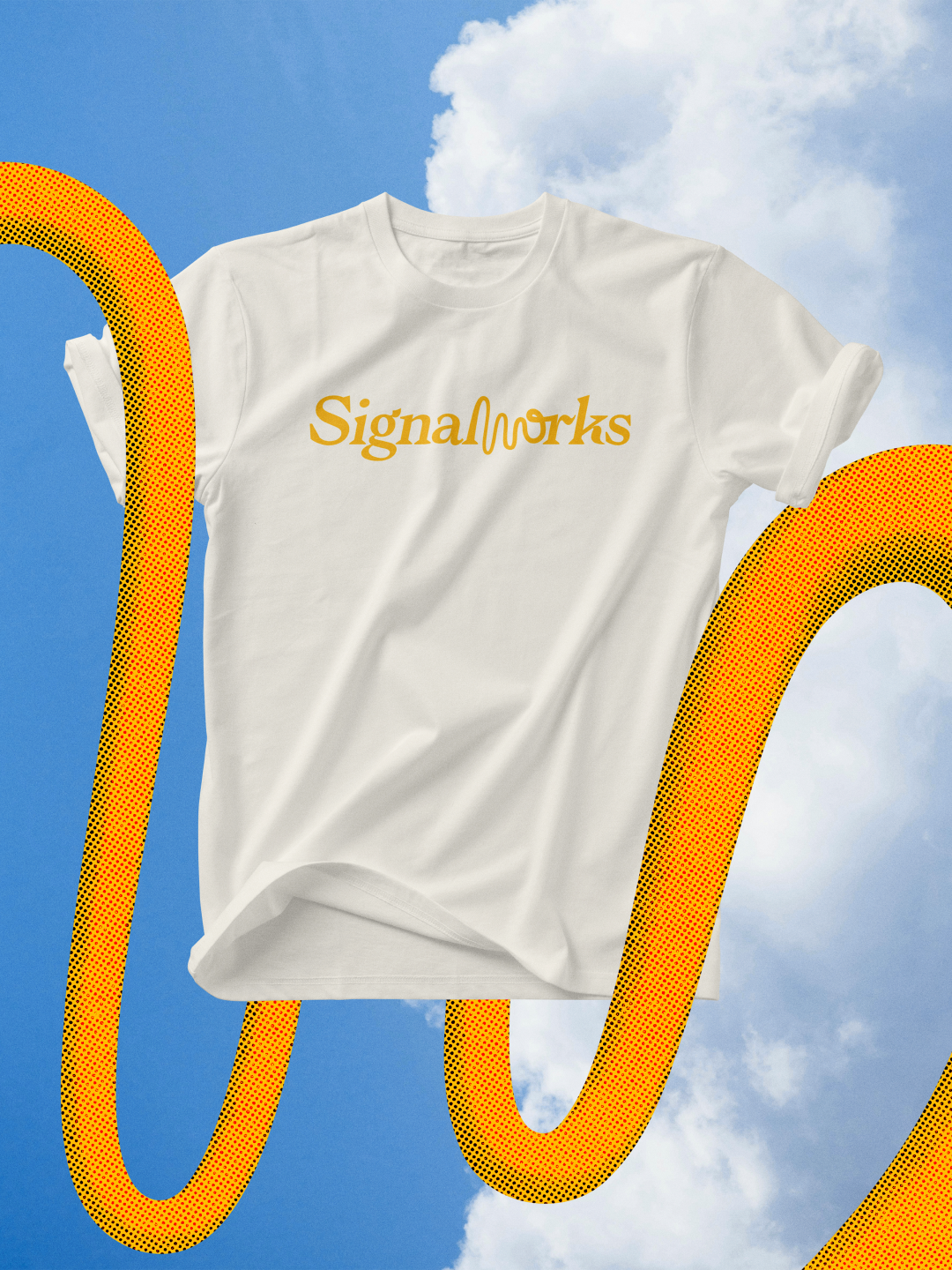
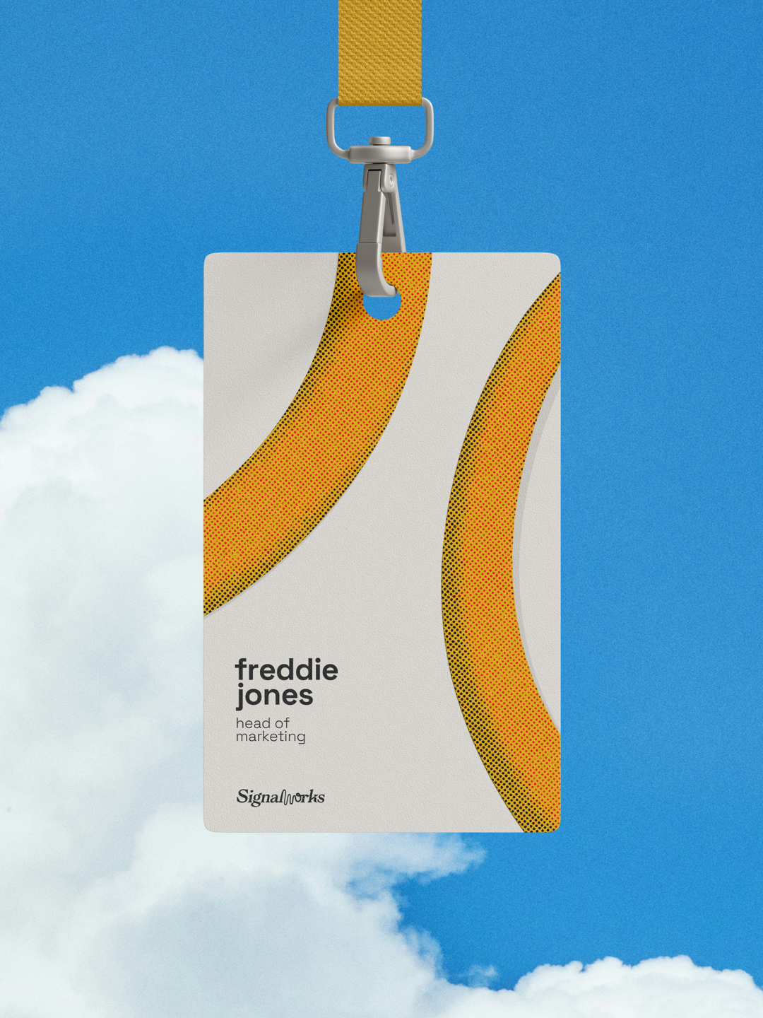
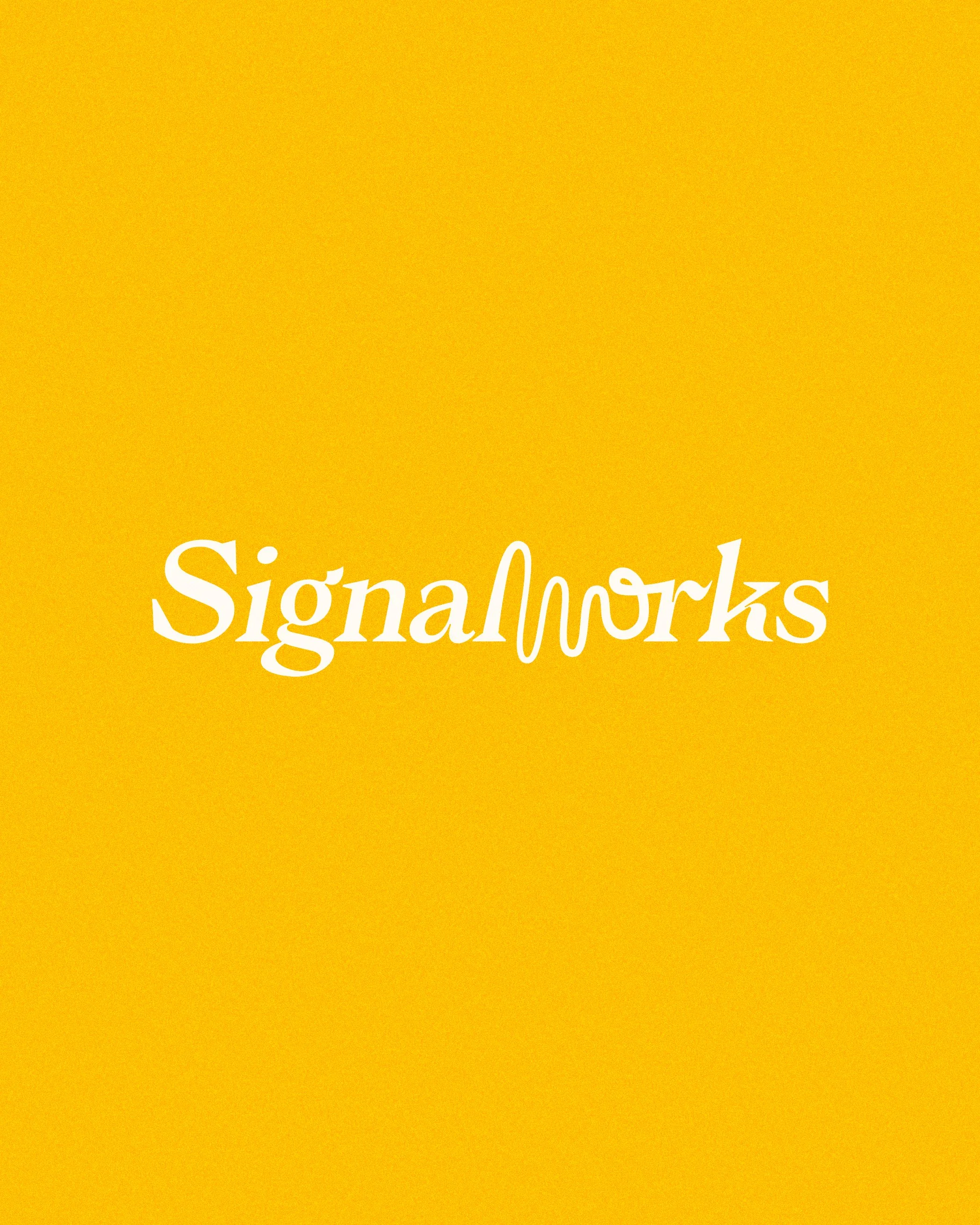
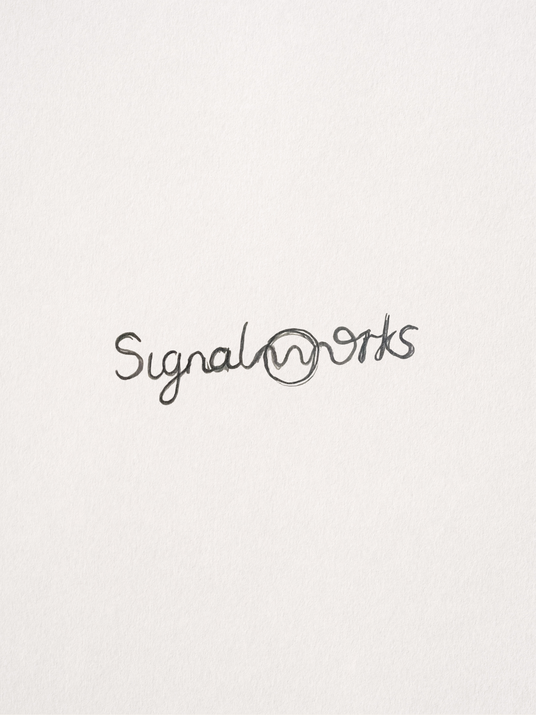
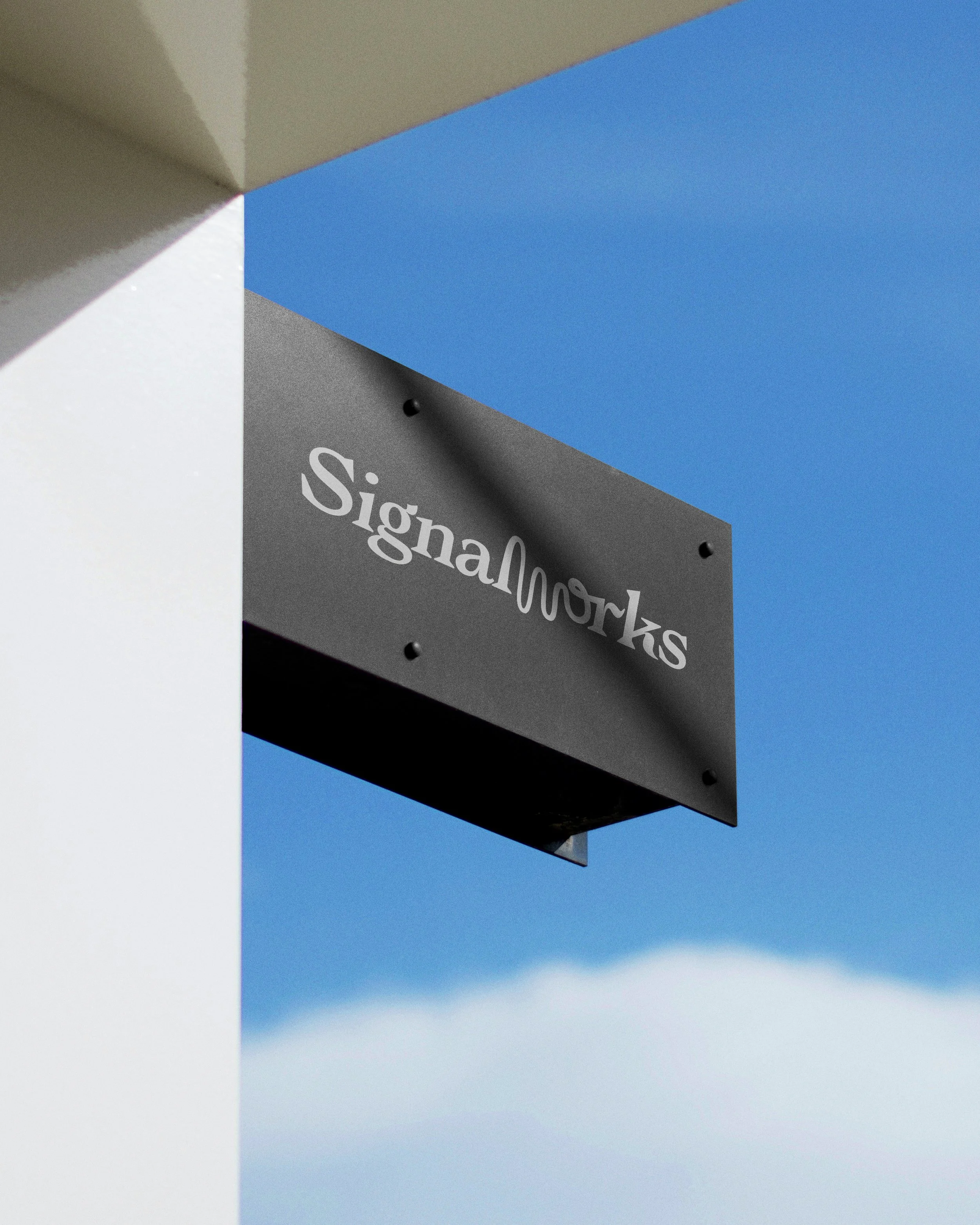
The identity centres on a distinctive wordmark that disrupts a classic serif structure with an organic signal wave, forming the ‘w’ before resolving back into the typeface. This interruption creates a clear focal point and visually represents signal cutting through background noise, clarity emerging from clutter.
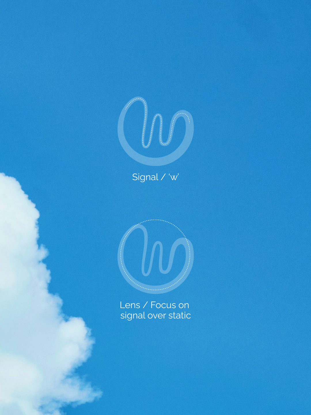
The accompanying logomark isolates this wave within a rounded lens form, reinforcing ideas of focus, amplification, and precision.
Together, the system balances structure with movement, and heritage with modernity, reflecting Signalworks’ approach to strategic thinking that is grounded, deliberate, and forward-looking.
The result is a confident, ownable identity that feels editorial and considered, designed to stand apart from familiar marketing tropes while clearly expressing what Signalworks stands for, clarity, focus, and meaningful communication.