Stillmere
Stillmere is a civil engineering consultancy specialising in flood risk, drainage, and training. Built on more than two decades of industry experience, the company provides the same high-level expertise as larger firms but with a more personal, pragmatic approach.
The brand identity needed to balance authority with approachability, positioning Stillmere as a trusted partner for architects, developers, and planning consultants while standing apart from competitors who often overcomplicate or dilute their offer.
The aim was to create a brand name that was memorable, meaningful, and practical, while also designing an identity that reflected clarity, problem solving, and professionalism. The brand needed to avoid industry clichés, achieve a timeless quality, and remain flexible across reports, training, and digital platforms.

Through a deep discovery phase, we identified the company’s core values: value for money, collaboration, simplicity, and a strong personal approach. These insights guided the creative direction.
The naming process explored linguistic roots and tonal qualities before landing on Stillmere. The name captures both character and meaning: Still reflects calm, controlled water as well as the founder’s steady demeanour; Mere, an Old English word for lake, grounds the brand in heritage and environment.
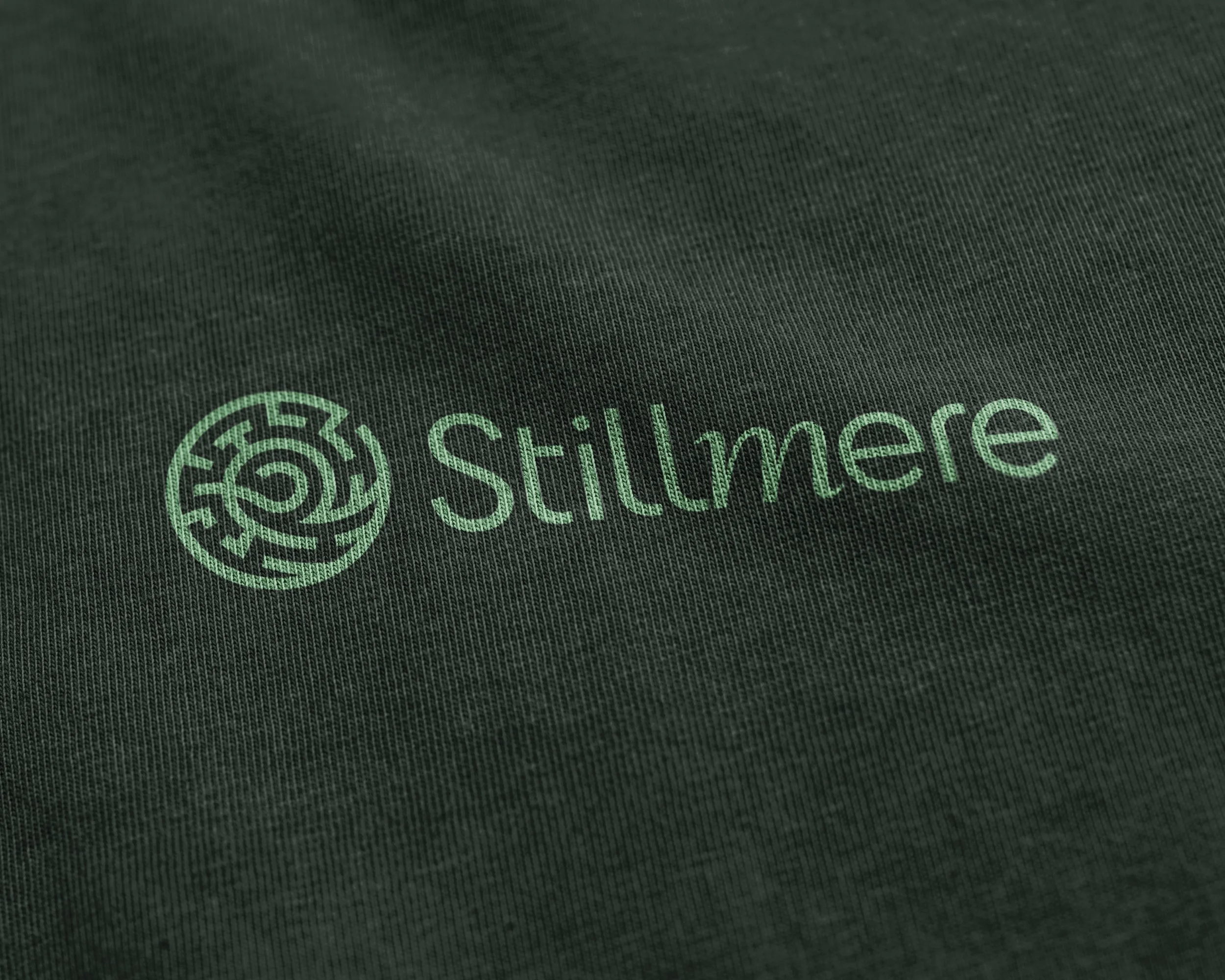
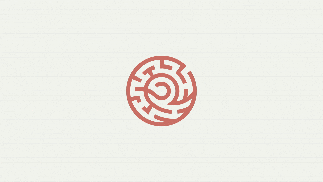
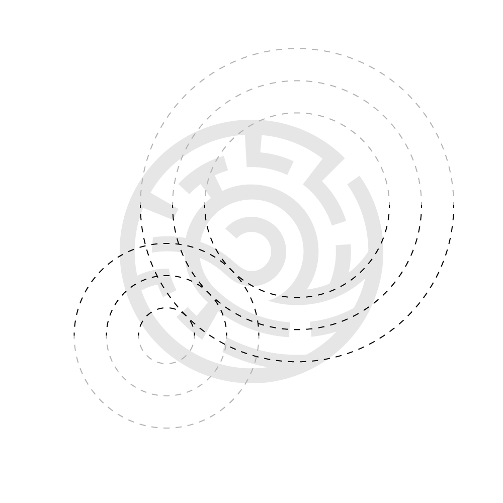
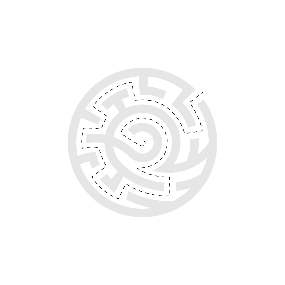
The visual identity extends this thinking. The logo combines three ideas in one form: water flow (waves running through the lower half), problem solving (a maze structure), and the profession itself (a circular form inspired by decorative Japanese manhole covers). The geometric sans serif wordmark adds clarity and precision, with an italicised “m” suggesting movement, symbolising water’s journey.
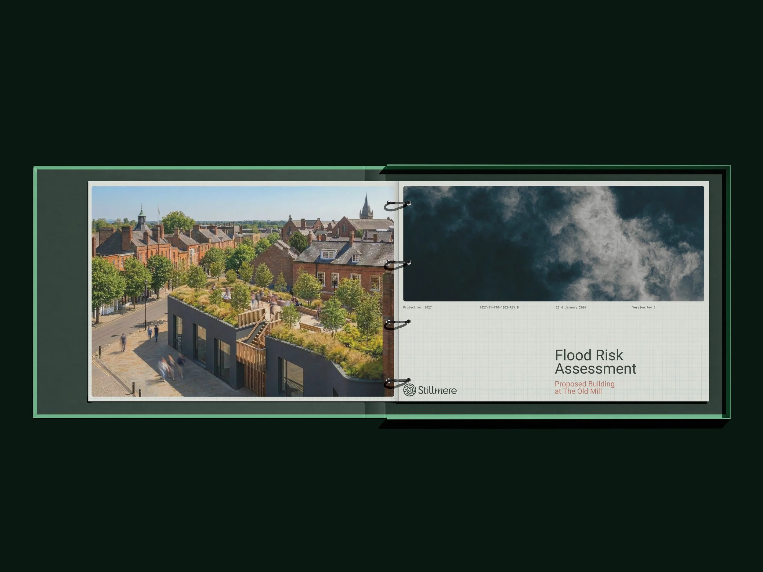
The imagery was to be kept positive, steering away from the usual dreary grey photos of flooding and drains. With beautiful photography (even in rainy situations, capturing reflections in water and with a warm tone), and trying to think in the vein of water causing a pleasing effect, in this case, watercolour.


Profession
A circular form inspired by decorated Japanese manhole covers, symbolising expertise in flood management.
Water
Flowing lines, reflecting water’s movement and the ease of the customer journey.
Problem Solving
A maze motif, representing expertise and clarity found through complexity.


The result is a brand that communicates authority, care, and expertise while feeling distinct in its sector.
From flood risk assessments to training seminars, Stillmere now has an identity that builds trust at every touchpoint and provides the confidence to grow.
The identity for Stillmere is complete and already in use across reports and communications, where it has been well received by the consultancy’s clients and partners. With the website now in development, the brand has a strong foundation in place and is on course to establish itself as a trusted name in flood risk and drainage consultancy.