

Territory

Mark wanted something different. A brand that balanced form and function, while also making the process creative, collaborative, and enjoyable
The challenge was to position Territory as a trusted partner rather than a supplier, and to shape an identity that felt bold, positive, and quietly confident.
Our early workshops explored wide ranging themes: mythology, the colour and culture of hip hop, and the outdoors. The outdoors resonated most, not only with the values of sustainability and craft, but also with Mark’s personal taste and personality. North American national parks, mid century typography, and outdoor workwear brands became key references. At this stage, Mark was still unsure about the name Territory, concerned about its possible negative connotations. The opportunity was to reframe the word as something more romantic, approachable, and symbolic of belonging.
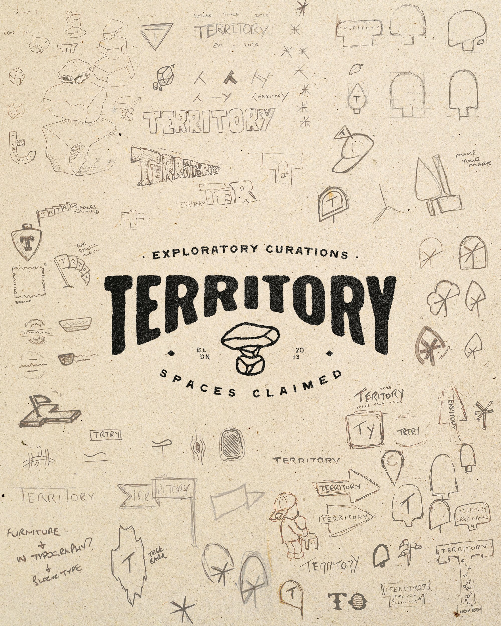

We approached the name by asking: How do people mark their territory in a meaningful way?


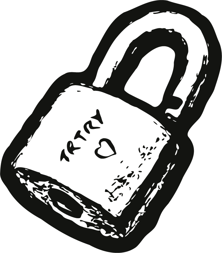
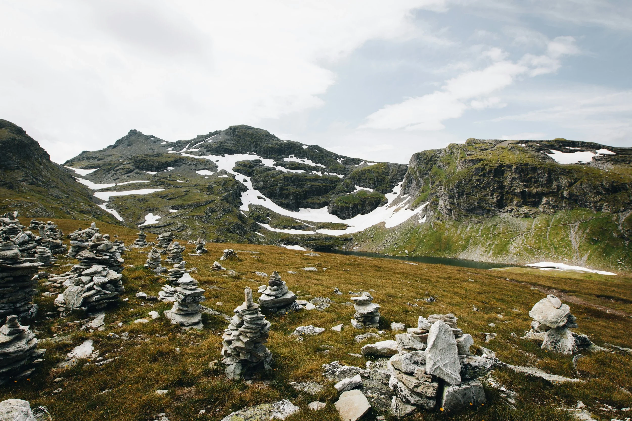
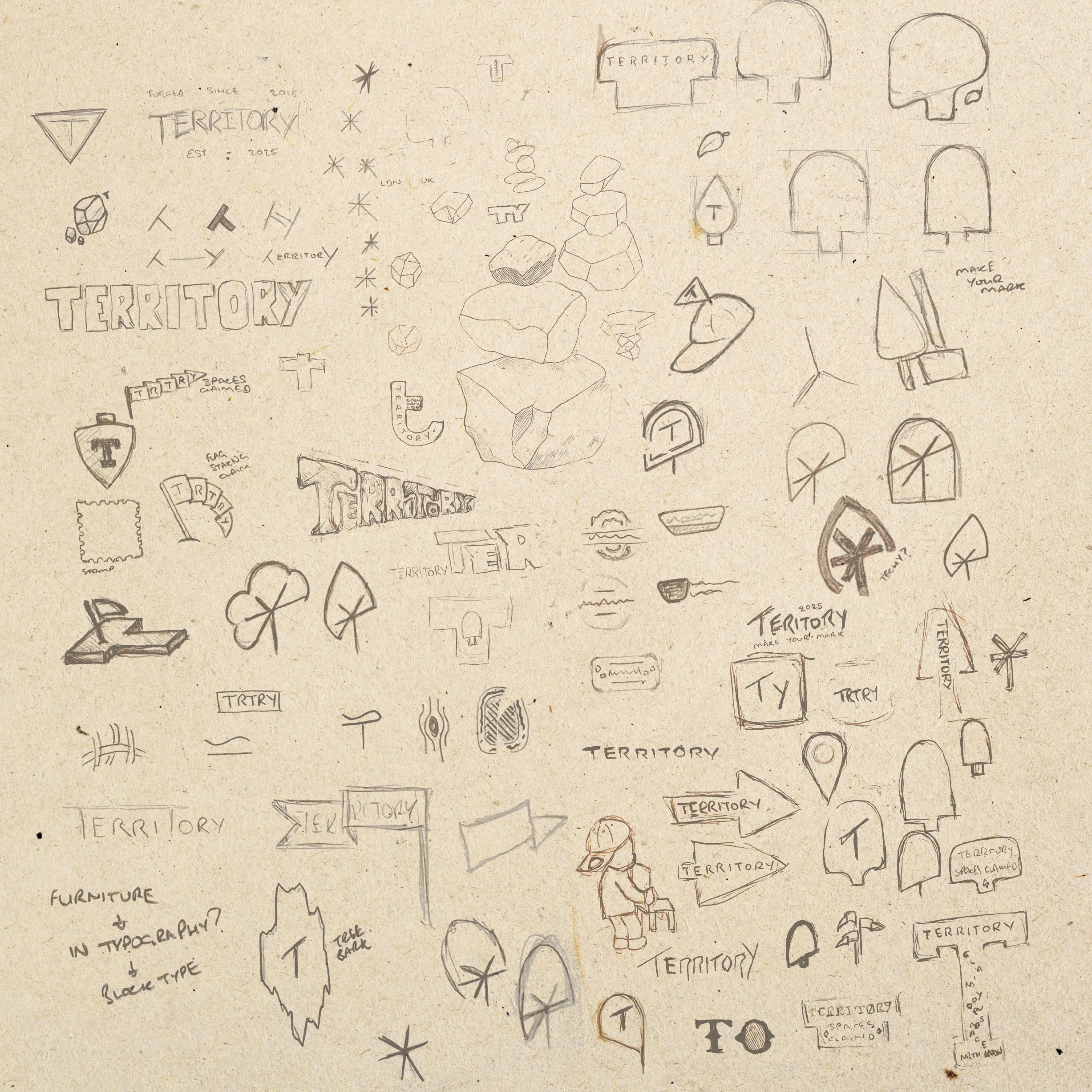
The answer came through universal human gestures such as carving initials into a tree, locking a padlock on a bridge, leaving a sticker, or stacking stones on a cairn. The cairn became central to the logo: three rocks forming a T, a lasting marker of presence and identity.
Other early concepts drew on the idea of initials carved into a tree, explored through a minimal tree shape with a “T” or “TY” at its centre. These options carried a sense of intimacy and personal mark making, and while Mark liked their simplicity, they ultimately felt a little too minimal for the ambition of the brand. The cairn struck the right balance between symbol and story, giving Territory a recognisable mark with conceptual weight.
The wordmark, inspired by mid century hand crafted typography and national park aesthetics, is bold yet softened, striking a balance between daring and approachable.


We expanded the identity around these ideas of nature, heritage, and personal marks.
A woodland inspired colour palette grounds the brand in earthy greens and browns, with names drawn from woods, finishes, and treatments. A vibrant enamel red serves as a striking accent, recalling the painted details of mid century tools and packaging. Textures, close up imagery, and illustration reinforce the tangibility and trustworthiness of the brand. Even an unused logo concept, a bear marking a tree, remains part of the illustration style, celebrating the playful and romantic notion of territory.
Typography was carefully chosen to carry this mid century outdoor feel into the written brand, with handmade inspired display fonts supported by accessible system fonts for practical use. The tagline “Exploratory Curations” distilled the brand promise: taking clients on a journey, balancing curiosity with expertise.
Deliverables included a full set of brand guidelines, a website, Canva templates for decks and social content, and social ready assets. These ensured Territory could scale its communications consistently, while leaving space for playful imagery and case study photography in future.


Dreamboat
Used for headlines as a confident display typeface with wide forms and soft edges. The slightly unrefined details keep it visually engaging and give key moments character and presence.
Wingman
Used across body copy to support the system with warmth and movement. Inspired by 1950s poster lettering, its hand-drawn forms, subtle lean, and gentle bounce keep longer text feeling friendly and human.


The final brand identity for Territory is quietly confident but not passive, bold but not intimidating.
It positions the business as a creativity first partner that helps clients mark their space in a way that feels personal, memorable, and sustainable. The cairn logo, versatile lockups, earthy palette, and tactile design language come together to build trust and recognisability.
Mark has embraced the brand wholeheartedly, praising the process and direction, and is already using the tools provided to build visibility. Future plans include extending the visual language with project photography and bespoke imagery, deepening the storytelling of Territory as it grows.


"Alex isn't your average brand designer!
He didn’t just listen to my aspirations, he encouraged ideas and challenged my vision, enabling my aspirations to be closely connected to my own personality and ultimately gave my company the right presence and voice!
The end result feels truly unique and I couldn’t be happier.”
– Mark Hobbs, Founder