

Mandula
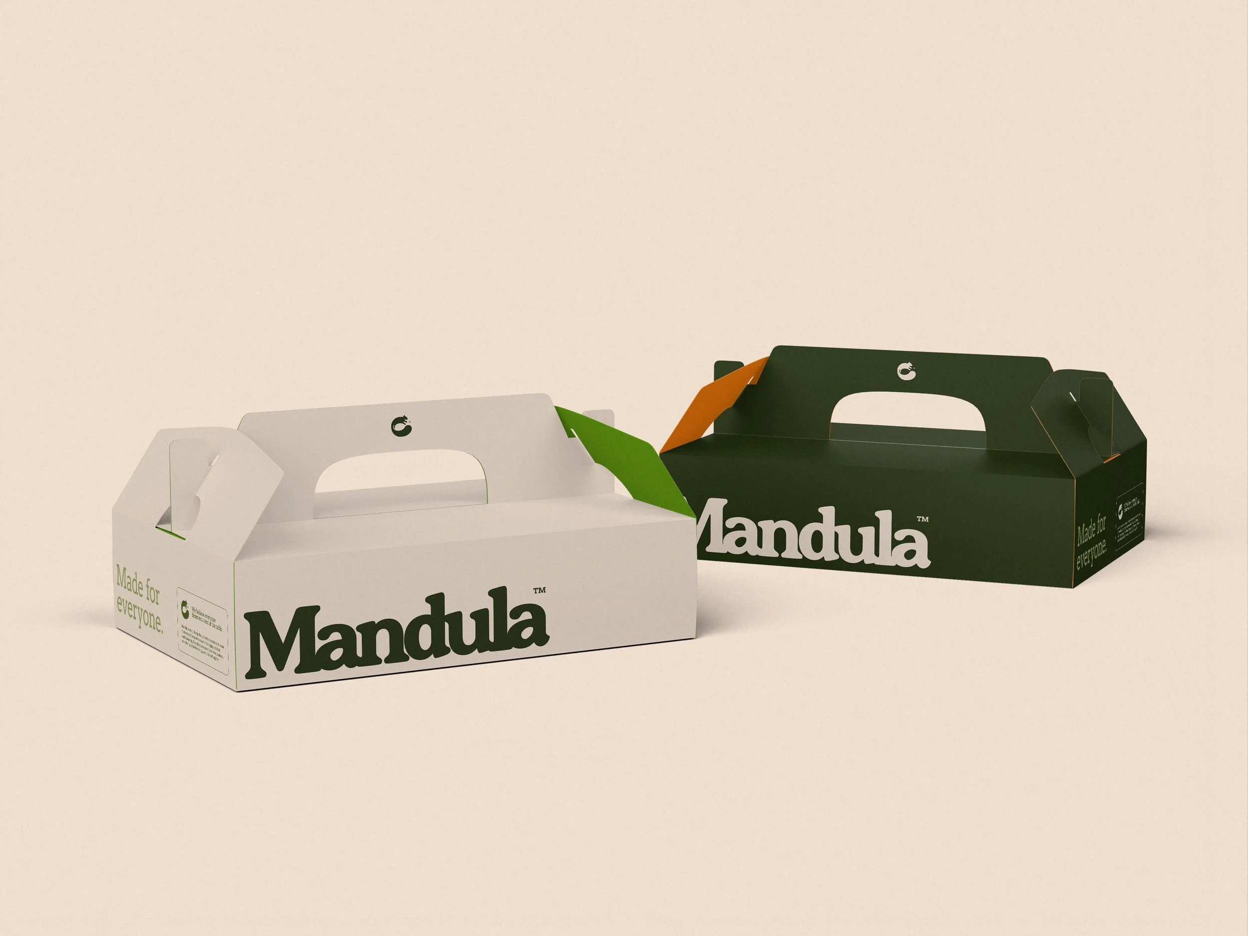
How a squirrel, an almond and Arthur's round table shaped the logo for Mandula, a Manchester gluten-free bakery.
Logo and Visual Direction / Food & Hospitality / 2026
Logo and visual direction for a Manchester gluten-free bakery supplying cafes and restaurants.
Mandula is a Manchester bakery making gluten-free cakes for cafes and restaurants. Named after the Hungarian word for almond, the ingredient behind most of its bakes, it exists for people who've been told there's nothing on the menu for them, and for the friends and family who'd rather not eat without them.
I created a logo and visual direction built around a circular squirrel mark, designed to be spotted on counters, menus and chalkboards as a sign that something good is here for everyone. Considered rather than precious, warm rather than cute, and free of the pinks and pastels that crowd the category.
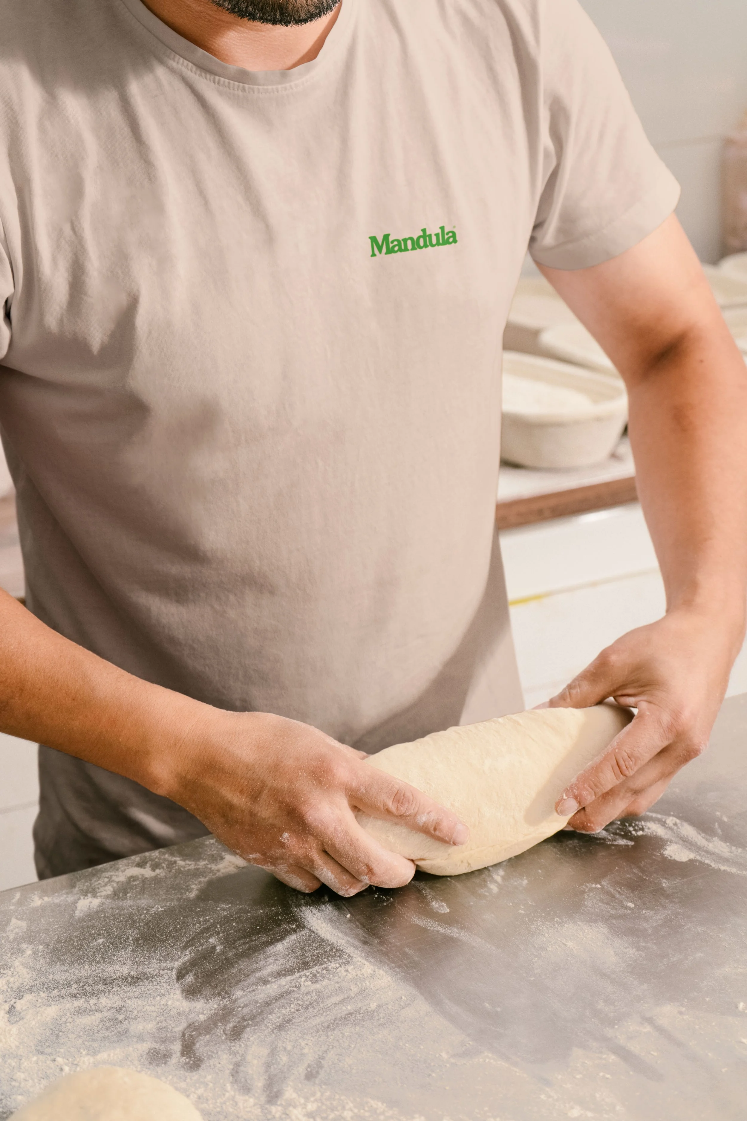
Discovery surfaced a story the founders knew too well.
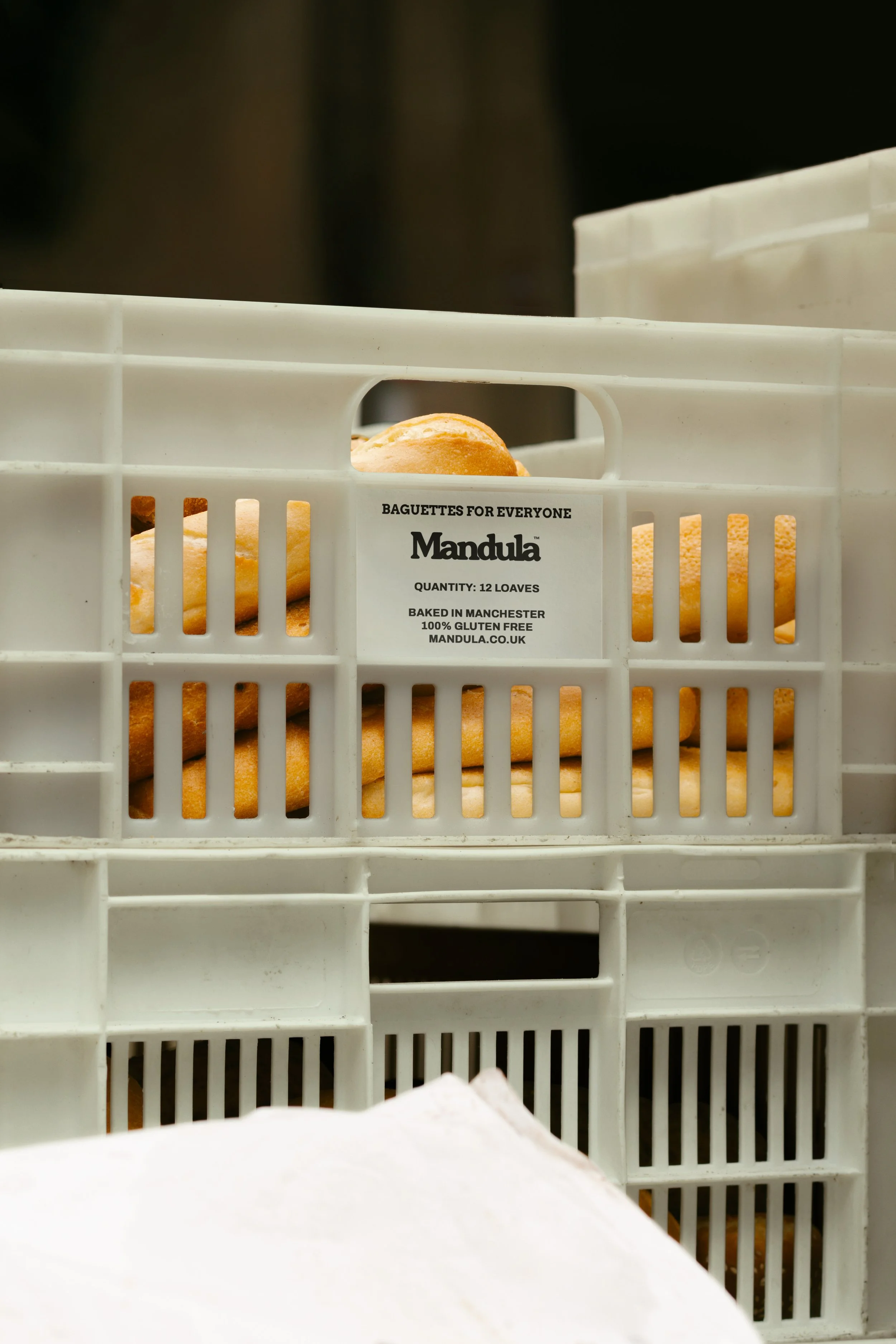
Go out with friends and you either all eat at the dedicated gluten-free spot, or you sit in a normal restaurant and get handed a spreadsheet instead of a menu. Mandula's answer is to supply the places people already go. With no shop of its own, the brand would have to speak for the business wherever it turned up.
That's why I chose an animal. Pictorial marks are far easier to remember than abstract ones, and a squirrel, an animal that lives on nuts, felt right for a brand named after the almond. It couldn't be cute, so I kept it as abstract as possible while still recognisable.
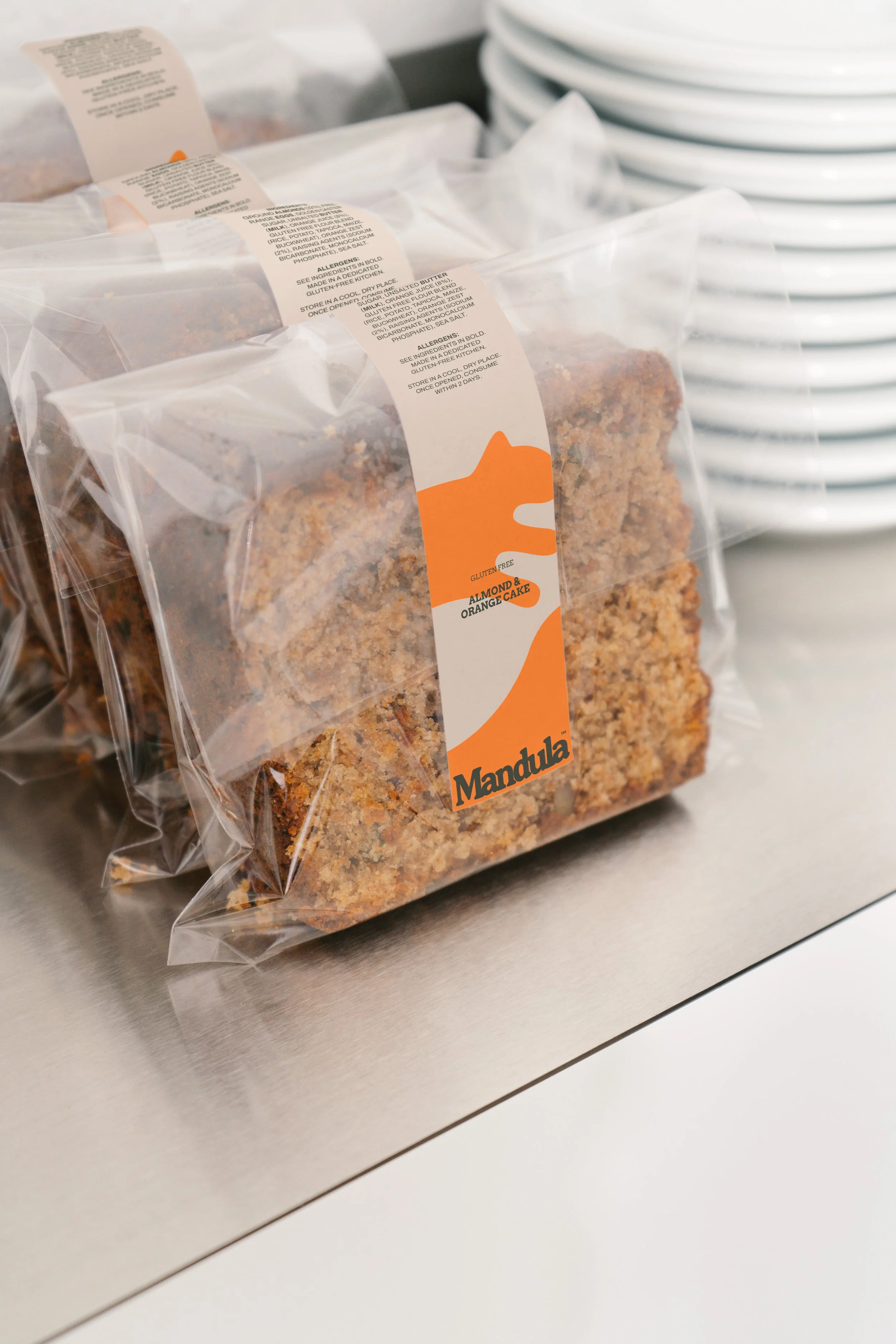
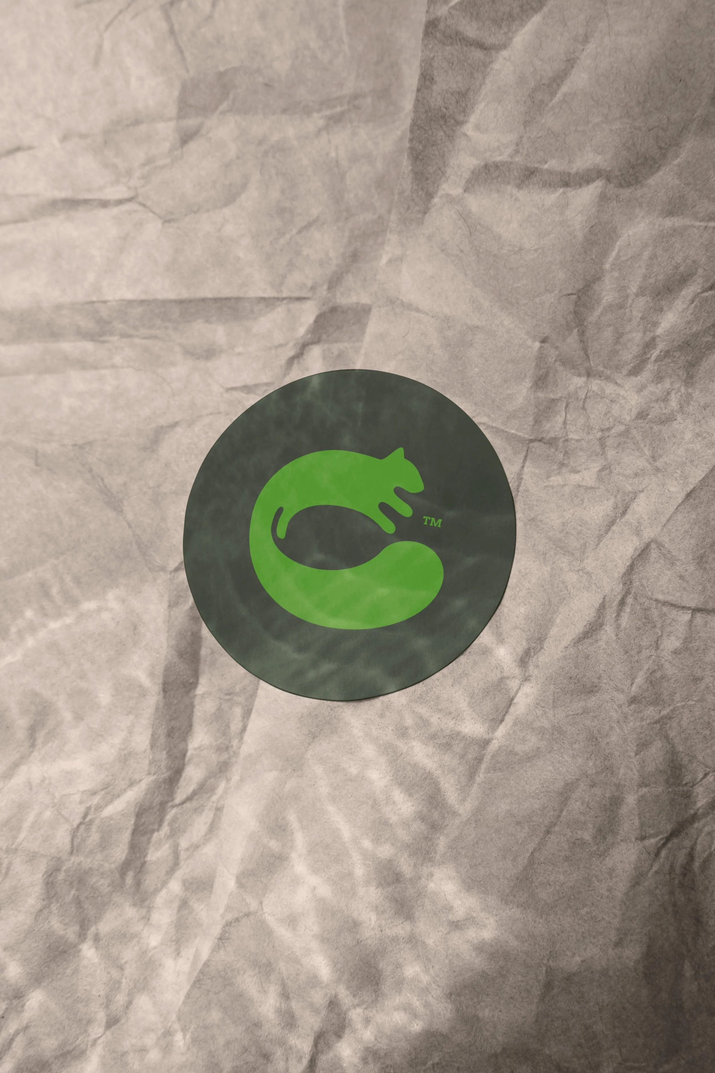
I wrapped it into a circle, inspired by Arthur's round table, where everyone sat as equals.
In the space the squirrel curls around sits an almond, a shape that returns in the counters of the word mark's a's. A leaping version, with the tail swept the other way, began to look a little too much like the Puma cat, so I returned to the original and refined it, balancing the bold tail against the body and the mark against the word mark.
The word mark began as a retro serif, chosen for a sense of heritage and the trust that comes with it. I tightened the spacing until the letters overlap, sitting together the way Mandula wants people to, and rounded off the cupped serifs to soften the tone and echo the curves of the mark.
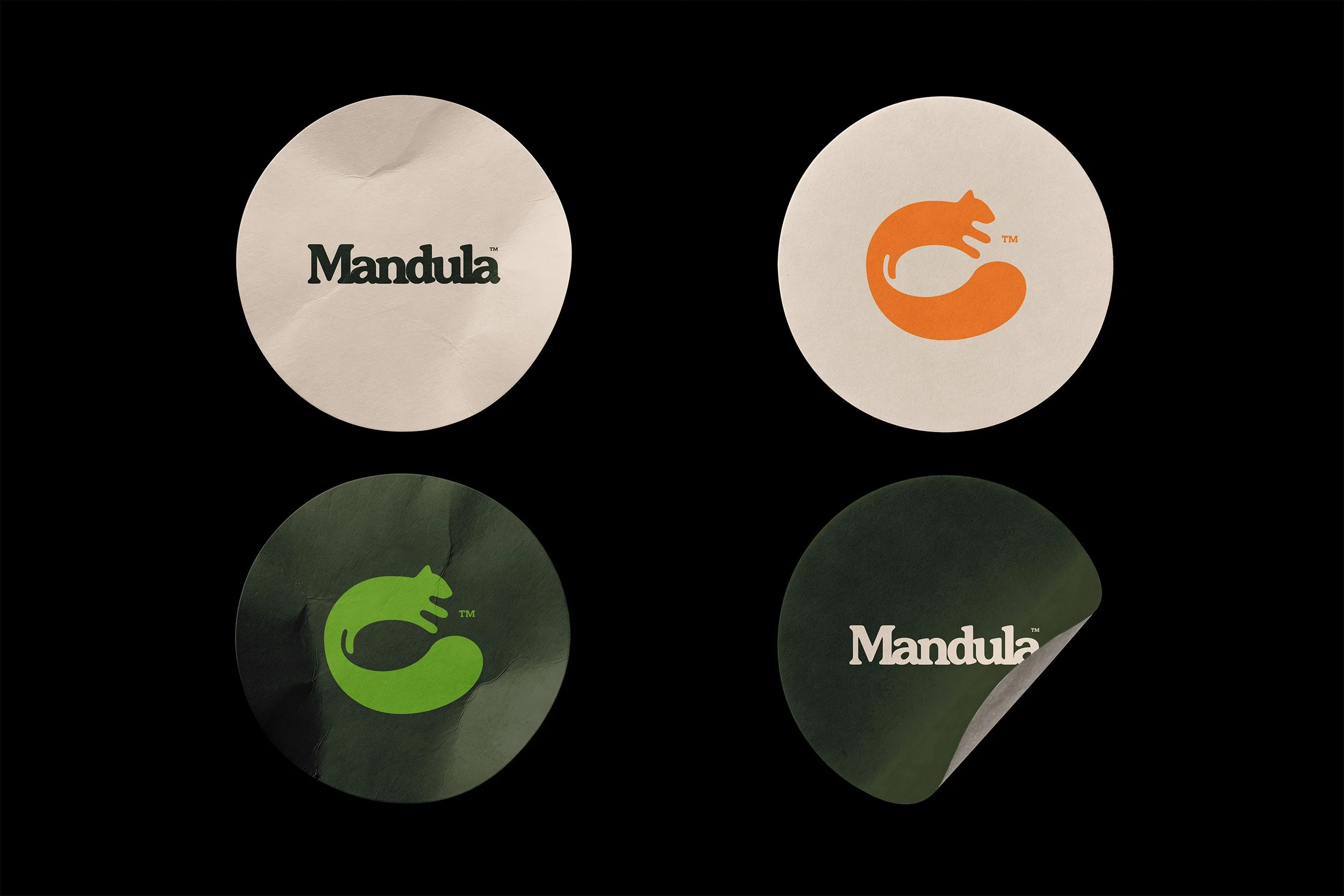
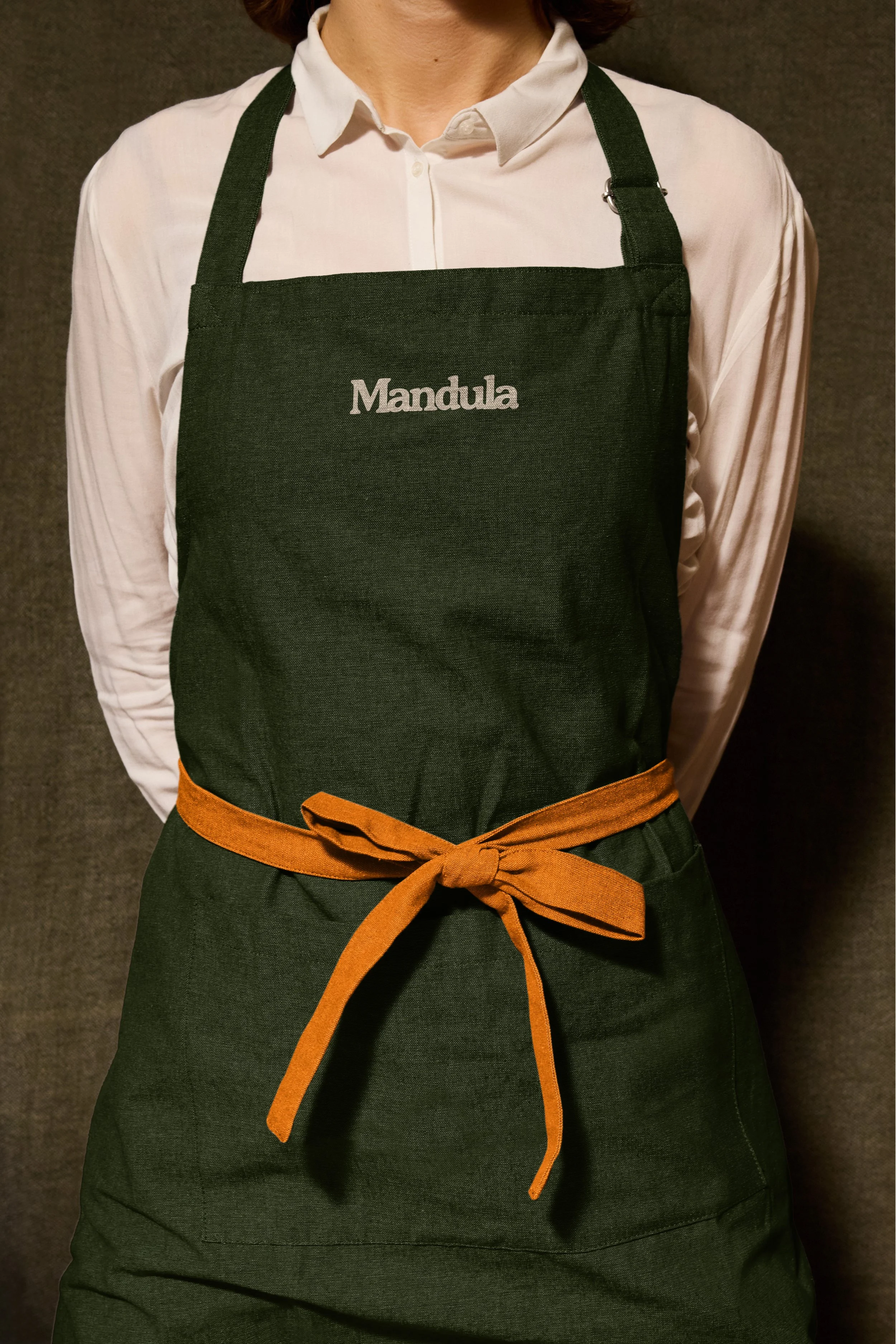
Where the market leans pink and peach, I went green and orange, with each colour named after a bake.
Almond and Almond Flour form the base, a Pistachio scale adds structure, and Matcha and Carrot Cake bring energy. Treacle Tart, a deeper orange, exists purely so text stays readable on Almond, which matters for a food brand printing allergen information.
Arvo's serifs pair naturally with the word mark for headlines, while Archivo keeps the small print clear. A handful of starting lines, like "We believe everyone deserves a seat at the table" and “For everyone” solidify their mission and give the founders a voice to grow into.
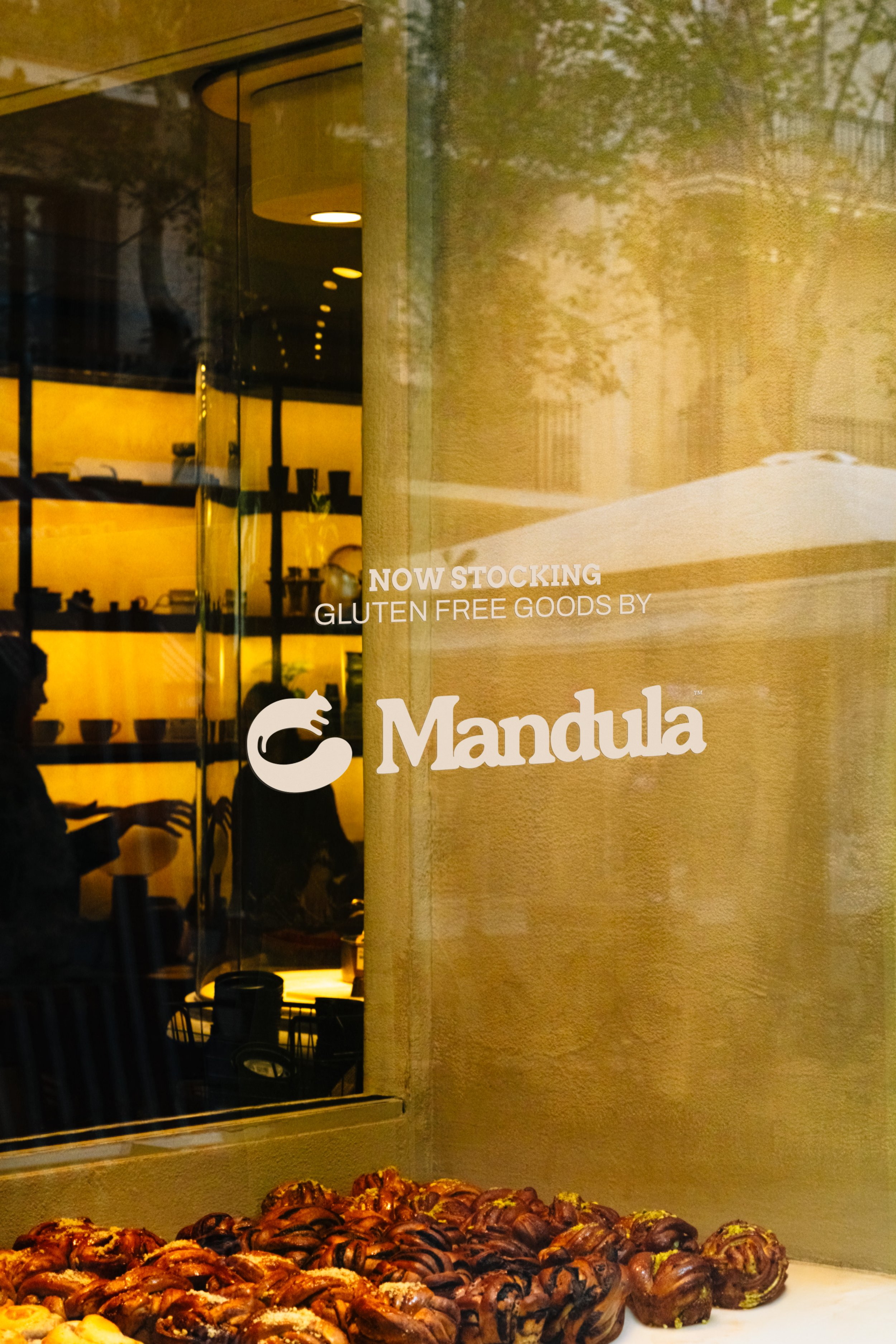
It's early days, but the squirrel is already turning up on the counters of local cafes. Small, round, and a sign that everyone's welcome at the table.
“Alex has been a pleasure to work with from start to finish.
His focus on listening to our goals really makes his work stand out, and we couldn't be happier with the end result. You won't regret hiring him.”
– Andres & Barbara Alfaro, Founders